In this guide, we want to review in-depth all major visual app store assets you, as an app marketer, have at your disposal to impact your mobile apps’ performance on the App Store and Google Play. These include the mobile app’s icon, screenshots, and preview / promotional video.
The choices app marketers make for these app store assets have a direct impact on the apps’ conversion rate. There are many things to factor in along the app’s marketing trajectory on the app stores, but these have a foundational effect on the app’s success.
We believe this guide will help both app marketers to optimize their iOS or Android apps for the App Store or Google Play respectively and app brand owners to appreciate the importance of visual creatives for the mobile app’s success.

Let’s begin with the mobile app’s greeting card – the icon.
App store asset: App Icon
Try to recall the apps you have on your iPhone or Android smartphone’s Home Screen? What are you doing now? You are mentally recalling the icons of apps on the Home Screen and then recalling the name of each. That is to say that the app’s icon is a mental label we keep in our memory for each app we use. But for every app on your Home Screen, there was the moment when you saw it for the first time and the icon’s look was one of the factors that swayed you towards choosing that particular app. Most likely an effect made by the icon didn’t even register with you but it was there.
App Store Optimization Buyer's Guide
Download our App Store Optimization Buyer’s Guide, covering all aspects of this essential app marketing technique to drive native traffic to your mobile app.
Our suggestions for you to design the best icon for your app are the following.
Keep it simple
As one proverb says “It’s easy to make it complex but it’s hard to make it simple”. Let’s get back to your smartphone’s screen, take a look at popular apps you use – what is common for all of them? Right – their design is simple, we live in a complicated world with lots and lots of cognitive load for our brains, and to be efficient with the app icon you need to come up with a simple design that won’t be stuffed with lots of elements but just a few simple and elegant components.
A good example of an app’s icon that checks all boxes is the following one from the Culture Code team, the author of the legendary Things app that was nominated multiple times by Apple. Take a closer look, it is simple, it depicts a recognizable “checkmark” that speaks to the purpose of the Things app – to be your to-do list app and it’s visually pleasing.
App icon design example
![]()
Source: Culture Code
Clear value proposition & purpose
When you think about the total number of apps on the App Store and Google Play, you may be overwhelmed – how is it even possible to stand out? But you need to remember that one of your first priorities, along with keeping the icon’s design simple, is explaining its purpose and communicating the value proposition of your app. Just like with this Things app icon above, a single visual element is capable of communicating what the app is about, it’s a matter of finding this element for your app.
Color brand consistency
Given the space constraints, it makes perfect sense to limit the number of colors used in your app’s icon between one and three. Remember that when people will be using your app on a daily basis, your app icon’s will be that familiar visual label to click on, they won’t need all those extra details you may want to include. Just like with our Things app’s icon example – you see the “checkmark” and you automatically click on it when you need to organize something because it is the check mark – no brainer.
The other thing to remember is the Dark mode on iOS or the Dark theme on Android. As great as your app’s icon is it needs to look equally good in both Light and Dark modes. Specifically, it comes down to visually optimizing the icon for white and black backgrounds. Harking back to the Things app as an example, as you can see the app’s logo has both white and black backgrounds to blend nicely with the overall background of the app’s pages for the Lite and Dark modes.
Example of the iOS Dark Mode vs Lite Mode on the App Store
![]()
Source: App Store
Very little or no text at all
When it comes to deciding on what text elements should be on the icon, you need to remember that your app users won’t be reading what it says on the logo. Getting back to the mental label thing, a few graphical elements with a unique palette of colors are all they need to identify your app and recall what is for. Of course, there are exceptions to this principle like calendar apps or apps that are known for their brand and they have a piece of text on it. Speaking of brands – this is what we’ll be covering next.
Icons for branded apps
When you build an app for a business that owns a brand, your natural inclination would always be to put that brand’s logo on the app’s icon. Here is what you need to remember – if the logo has a unique palette of colors you can absolutely incorporate it into your app’s icon or the entire icon can be your brand’s logo. It doesn’t matter if the colors are bright or dim – the human brain always registers a difference between your app and others on the smartphone screen.
And don’t worry if your brand’s recognition is yet to become as high as your competition, from day one your mobile app’s logo should be visually consistent with your brand to help it grow.
Seasonal updates
Several times a year, in different regions of the world people celebrate holidays that touch on many aspects of their lives. Some of those holidays are widespread across multiple countries, some are strictly limited to specific regions. All of those occasions can be a good opportunity to temporarily update your app’s icon to show your app users that you support the same cause as they do or simply share their holiday mood. In any case, updating your icon is a powerful way to build trust with your app users, especially if the icon update speaks to the shared values.
The app icon’s update should always be a part of your brand’s visual update across desktop and mobile and of course – don’t forget that that update has a limited-time relevancy, don’t let that X-mas themed logo to stay on till the next summer :-).
A/B testing
The final piece of the puzzle for mobile apps’ icon design best practices is A/B testing. Even some of the most successful app brands you can think of didn’t necessarily get their app’s icon right initially. If you’re launching your app on the App Store or Google Play, it’s always a good idea to test different ideas for how the app’s icon should look like. People’s perceptions of your app icon may significantly differ from your perception and it needs to be investigated via A/B testing.
You can use A/B testing platforms like SplitMetrics to gauge your app’s icon visual appeal to the app’s audience and how well it allows you to convert the app.
Finally, you should always keep your eye on both Apple’s best practices for the iOS app icon design and what Google suggests.
Keeping those suggestions from Apple and Google on your radar, you can even enlist the Generative AI Midjourney and ChatGPT tools to design an icon for your app, check out some ideas here:
Designing unique iOS app icons with ChatGPT and Midjourney
Source: YouTube
Now, let’s switch the gears – from the app’s icon to its screenshots and their significance for the app’s conversion rate.
Featured App Store Optimization Companies

App store asset: App Screenshots
App screenshots are the next component of your app marketing copy for the App Store or Google Play that you need to get right to increase the app’s conversion rate.
To beat competitive apps you need to think through really hard what your app’s screenshots will be representing visually. If the screenshots are complicated with too many details, your app may come across as too hard to use and your potential users will move on to another apps. A good rule of thumb is to focus each screenshot on a single feature you want your potential users to know and in general terms your app screenshots need to:
- be visually consistent with your brand
- speak clearly about the app’s purpose
- present the app’s competitive advantage(s)
- show off the app’s user interface that is both appealing but not in the way
- be localized for each app market you want to release your app to
Both iOS and Android app screenshots can be in portrait or landscape orientation and it gives you a great opportunity to show certain visual details of your app’s interface or environment your app can be used front and center. Because the screenshots are placed in line and next to each other it’s even possible to zoom in on a specific app’s feature you want to focus on by spitting a big image between two or more screenshots like a puzzle.
iOS
The following example demonstrates how splicing a single image between two screenshots, among a set of 10 screenshots that Apple allows you to provide for the iOS app, enables the Pandora iOS app team to create the perception of continuity, it helps the app visually stand out the rest people can see on the App Store Must Have Apps list where Apple’s editors team list apps that are extremely popular among iOS app users.
Pandora iOS app screenshots
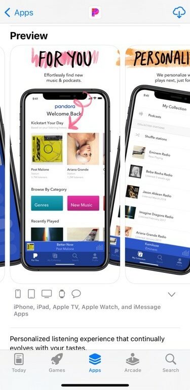
Source: App Store
Since mobile app screenshots are supposed to represent how those apps’ interfaces should look like on different iOS and iPadOS devices, Apple provides the following table with the screenshot requirements. To create and upload screenshots for your iOS app you need to follow the guidelines you can see below.
screenshot requirements for various iOS and iPadOS devices
| Device display size | Screenshot size | Requirement | Screenshot source |
|---|---|---|---|
| 6.7" iPhone 14 Pro Max | 1290x2796 px (portrait), 2796x1290 px (landscape) | Required if app runs on iPhone and 6.5-inch screenshots aren't provided | Upload 6.7-inch screenshots |
| 6.5" Display iPhone 14 Plus, iPhone 13 Pro Max, iPhone 12 Pro Max, iPhone 11 Pro Max, iPhone 11, iPhone XS Max, iPhone XR | 1284 x 2778 pixels (portrait), 2778 x 1284 pixels (landscape), 1242 x 2688 pixels (portrait), 2688 x 1242 pixels (landscape) | Required if app runs on iPhone and 6.7-inch screenshots aren't provided | Default: Scaled 6.7-inch screenshots, Alternative: Upload 6.5-inch screenshots |
| 6.1" Display iPhone 14 Pro | 1179 x 2556 pixels (portrait), 2556 x 1179 pixels (landscape) | Required if app runs on iPhone and 6.5 inch or 6.7-inch screenshots aren't provided | Default: Scaled 6.5-inch or 6.7-inch screenshots, Scaled 6.5-inch when 6.5-inch and 6.7-inch screenshots are both uploaded, Alternative: Upload 6.1-inch screenshots |
| 5.8" Display: iPhone 14, iPhone 13 Pro, iPhone 13, iPhone 13 mini, iPhone 12 Pro, iPhone 12, iPhone 12 mini, iPhone 11, Pro iPhone XS, iPhone X | 1170 x 2532 pixels (portrait), 2532 x 1170 pixels (landscape), 1125 x 2436 pixels (portrait), 2436 x 1125 pixels (landscape) 1080 x 2340 (portrait), 2340 x 1080 (landscape) | Required if app runs on iPhone and 6.5 inch or 6.7-inch screenshots aren't provided | Default: Scaled 6.5-inch or 6.7-inch screenshots, Scaled 6.5-inch when 6.5-inch and 6.7-inch screenshots are both uploaded, Alternative: Upload 5.8-inch screenshots |
| 5.5" Display: iPhone 8. Plus iPhone 7 Plus, iPhone 6s Plus | 1242 x 2208 pixels (portrait), 2208 x 1242 pixels (landscape) | Required if app runs on iPhone | Upload 5.5-inch screenshots |
| 4.7" Display: iPhone SE (3rd generation, 2nd generation) iPhone 8, iPhone 7, iPhone 6s, iPhone 6 | 750 x 1334 pixels (portrait), 1334 x 750 pixels (landscape) | Required if app runs on iPhone and 5.5-inch screenshots aren't provided | Default: Scaled 5.5-inch screenshots, Alternative: Upload 4.7-inch screenshots |
| 4" Display: iPhone SE (1st generation) | 640 x 1096 pixels (portrait without status bar), 640 x 1136 pixels (portrait with status bar), 1136 x 600 pixels (landscape without status bar), 1136 x 640 pixels (landscape with status bar) | Required if app runs on iPhone and 5.5 or 4.7-inch screenshots aren't provided | Default: Scaled 5.5 or 4.7-inch screenshots, Alternative: Upload 4-inch screenshots |
| 3.5" Display iPhone 4s | 640 x 920 pixels (portrait without status bar), 640 x 960 pixels (portrait with status bar), 960 x 600 pixels (landscape (without status bar), 960 x 640 pixels (landscape with status bar) | Required if app runs on iPhone and 5.5-inch iPhone screenshots aren't provided | Default: Scaled 5.5-, 4.7-, or 4-inch screenshots, Alternative: Upload 3.5-inch screenshots |
| 12.9" Display: iPad Pro (6th generation, 5th generation, 4th generation, 3rd generation) | 2048 x 2732 pixels (portrait), 2732 x 2048 pixels (landscape) | Required if app runs on iPad | Upload 12.9-inch iPad Pro (3rd generation) screenshots |
| 12.9" Display iPad Pro (2nd generation) | 2048 x 2732 pixels (portrait), 2732 x 2048 pixels (landscape) | Required if app runs on iPad | Upload 12.9-inch iPad Pro (2nd generation) screenshots |
| 11" Display: iPad Pro (4th generation, 3rd generation) iPad (10th generation) iPad Air (5th generation, 4th generation) iPad mini (6th generation) | 1488 x 2266 pixels (portrait), 2266 x 1488 pixels (landscape), 1668 x 2388 pixels (portrait), 2388 x 1668 pixels (landscape), 1640 x 2360 pixels (portrait), 2360 x 1640 pixels (landscape) | Required if app runs on iPad and 12.9-inch iPad Pro (2nd generation) screenshots aren't provided | Default: Scaled 12.9-inch iPad Pro (3rd generation) screenshots, Alternative: Upload 11-inch screenshots |
| 10.5" Display: iPad (9th generation, 8th generation, 7th generation) iPad Pro iPad Air | 1668 x 2224 pixels (portrait), 2224 x 1668 pixels (landscape) | Required if app runs on iPad and 12.9-inch iPad Pro (2nd generation) screenshots aren't provided | Default: scaled 12.9-inch iPad Pro (2nd generation), screenshots Alternative: Upload 10.5-inch screenshots |
| 9.7" Display: iPad iPad mini | 1536 x 2008 pixels (portrait (without status bar), 1536 x 2048 pixels (portrait with status bar), 2048 x 1496 pixels (landscape without status bar), 2048 x 1536 pixels (landscape with status bar), 768 x 1004 pixels (portrait without status bar), 768 x 1024 pixels (portrait with status bar), 1024 x 748 pixels (landscape (without status bar), 1024 x 768 pixels (landscape with status bar) | Required if app runs on iPad and 12.9-inch iPad Pro (2nd generation) or 10.5-inch screenshots aren't provided | Default: Scaled 12.9-inch iPad Pro (2nd generation) or 10.5-inch screenshots |
Source: Apple Inc.
Android
On the Android side, Google doesn’t provide as extensive specifications as Apple does for iOS but still has certain guidelines in place for Android developers to follow. According to these guidelines, developers can upload up to 8 screenshots for each supported device type.
The list of supported device types include:
- smartphones
- tablets (7 and 10-inch)
- Android Tvs
- Wear OS watches
When it comes to large screens, such as Chromebook and tablets, Google encourages developers to upload up to 4 screenshots (between 1,080 and 7,680px in size) to demonstrate in-app experience to the app’s potential users. All those screenshots should have 16:9 aspect ratio for landscape and a 9:16 aspect ratio for portrait orientation.
If releasing the app’s version for Wear OS is part of your app release strategy make sure to comply the following guidelines from Google:
- include at least a single screenshot that accurately depicts the current version of the app on Wear OS
- provide screenshots showing only the app interface
- keep the screenshots free of additional text, graphics, or backgrounds that are not part of the interface of the app
- Include screenshots with a 1:1 aspect ratio and with a minimum size of 384 x 384 pixels.
- If your app offers Tiles, then we recommend sharing a screenshot of Tiles functionality.
- Don’t include transparent backgrounds or masking
If a set of screenshots is provided along with a promotional video, the latter will be visible on the Google Play page first and screenshots that fit to the device screen resolution the best be placed on the right of the video.
Now, let’s address the set of content guidelines Google has for Android app screenshots in place. To publish an Android app on the Google Play store, developers need to submit at least two screenshots in .JPEG or 24-bit .PNG format (with no alpha channel), between 320 and 3840px in size. The maximum dimension of your screenshot can’t be more than twice as long as the minimum dimension.
List of Best ASO Tools and Agencies
Because certain sections of the Google Play store feature groups of recommended apps and game in a large format using screenshots, you need to design an additional set of screenshots that meet the following requirements:
- for apps, you need to submit at least 4 screenshots in 1,080px resolution or higher, both in portrait 9:16 ratio 1,080×1,920 px and landscape orientation 16:9 ratio 1920×1,080px resolution
- for games, you need to submit at least 3 screenshots 16:9 ratio 1,920×1,080 px resolution or 3 portrait screenshots with 9:16 ratio and 1,080×1,920 px resolution
- screenshots mush demonstrate in-app or in-game experience, focus on their content and set expectations for what potential users experience will look like
- in-game screenshots should be taken directly from the device, unless the game usage is off-device.
And now we’re moving on the last piece of the iOS and Android app visual assets set iOS or Android app developers can use to compete visually on the App Store or Google Play.
App store asset: App Preview Video
The most visually impactful asset of a mobile app marketing copy is its demo video clip. Neither the app’s icon nor its set of screenshots are capable to deliver such vivid and lively hint for what a mobile gameplay or app using experience like as a video clip. A human’s perception of any information is subjective and a demo video clip is not an exception, meaning A/B testing is the way to go with app preview videos to identify the most effective version to stick to.
A few things to keep in mind to create a really impactful App Preview video clip for the App Store:
- always keep the app’s user experience while optimizing the video
- make sure the first few seconds of a video clip shows the app / game’s core features
- the 30 seconds is the limit and the whole clip should be optimized for this lengh
- the video should present the actual app’s footage
- it should be an attention grabber
- include value propositions to make the vide easy-to-follow
- do not include pricing
Now let’s dive closer and first take a look at the iOS side.
iOS
Apple has a set of requirements for a video clip to be used to showcase an iOS app features on the App Store. It refers at using Apple’s proprietary video format to ensure superior watching experience for the app’s potential users the moment they make a decision about installing a particular app.
App preview video specifications
| H.264 format | ProRes 422(HQ only) format |
|---|---|
| 10-12 Mbps | VBR ~220 Mpbs |
| Progressive, up to High Profile Level 4.0 | Progressive, no external references |
| 30 frames per second | 30 frames per second |
| Stereo Codec: 256kbps AAC Sample Rate: 44.1kHz or 48kHz All tracks should be enabled Stereo configuration: 1 track with 2-channel stereo (1st channel L and 2nd channel R) 2 tracks with 1-channel stereo (1st track L and 2nd track R) | Stereo Codec: PCM or 256kbps AAC Bit Depth (for PCM): 16-, 24-, or 32-bit Sample Rate: 44.1 or 48kHz All tracks should be enabled Stereo configuration: 1 track with 2-channel stereo (1st channel L and 2nd channel R) 2 tracks with 1-channel stereo (1st track L and 2nd track R) |
| .mov, .m4v, .mp4 | .mov |
App preview resolutions are similar to Apple’s requirements for iOS app’s screenshots and cover the same spectrum of device resolutions.
App Preview requirements
| Content | Description |
|---|---|
| Maximum file size | 500MB |
| Minimum length | 15 Seconds |
| Maximum length | 30 Seconds |
| Default poster frame setting | 5 Seconds |
| Orientation | Portrait or Landscape (Note: macOS app previews accept landscape only.) |
| OS device capture and play | iOS 8 or later |
| Upload and playback on App Store Connect | Safari 8 and macOS 10.10 or later |
Below you can see examples of some of the best App Preview videos. Notice how each video manages to explain the app’s purpose visually right in the search results even before you open that app’s dedicated page on the App Store. This is important because at that point the app user hasn’t decided on what app in the search results to take a closer look at and your app’s effective App Preview video can be a decisive factor.
App store assets: App Preview video examples
Source: YouTube
Moving on to the Android side, let’s see what are the best practices for App Preview videos there and what are the guidelines from Google.
Android
Above all, because Google owns YouTube it’s quite natural for the Google Play store to have YouTube as the hosting platform for app preview videos. And here lays an advantage for Google Play compared with the App Store from Apple – Android app developers can leverage YouTube for their apps promotion, attract more potential app users, increase installs and potentially drive more sales. The other key difference from the iOS App Store is that on Google Play Preview videos are always presented in horizontal orientation.
Creating a Preview video for your Android app you need to keep in mind these points:
- Depending on if an Android device is connected to the Internet, the video will be played automatically. If it’s in the autoplay mode, it will be played muted and only its first 30 seconds get to be played;
- Because Preview videos are hosted on YouTube, Google doesn’t limit them with 30 seconds, they can actually be much longer for Android app developers to use them for promotional needs (see above);
- Preview videos are located right on the left from the app screenshots
- Because videos by default are played muted, Google allows to add subtitles (which can’t contain any indications for the app’s performance on Google Play – no bragging about it’s on the top or being downloaded a gazillion times and not call-to-action)
- Focus on real in-game or in-app experience (the footage of the gameplay or app usage experience should occupy at least 80% of the video) and keep branding minimal.
Key takeaways
Visual app store assets for your iOS or Android app such as its icon, screenshots and preview video are essential to help your app stand out the rest, spark people’s interest in your app and convince them to download it.
Here are a few key takeaways we believe will be helpful for you to remember throughout the lifecycle of your app:
- it’s absolutely crucial to get the app store asset visual right for a mobile app to successful in a long run
- even if you believe you’ve polished your app’s icon, screenshots and preview video really hard, your users may not share your optimism
- a solid A/B Testing platform is key to identify what visual creatives are the most efficient for your app
- make sure you focus your app’s screenshots one key feature per screenshot
- the first 10 seconds of your app’s preview video is the time frame when your potential users decide on your app – make sure they talk about its best feature