It was a sunny day, at least in Cupertino, California, on July 10, 2008, when Apple Inc. launched the first of its kind online store for mobile apps – the App Store. Initially, the volume of apps was minuscule – about 500 apps. 15 years later, it’s a vibrant ecosystem with 1.6 million apps, and in 2022 alone, it generated $1.1 trillion in sales for iOS developers. Today, to beat such high competition, doing App Store Optimization for iOS is a must for brands and all developers who build apps for the Apple platform.
The App Store has 24 categories and is available in 175 countries around the globe in 40 languages. Comparing both major app stores— the Google Play from Google and the App Store from Apple— the former has been leading in volume and the latter in revenue generated for app developers. But less volume doesn’t mean it’s easier to compete; Apple’s App Store is as competitive as its Android counterpart. According to one recent research, iOS app users spend money in apps seven times as much as their Android counterparts, while offering only half of the number of users that the Android platform is capable of offering.
In this guide, we want to help you to do App Store Optimization for iOS, so your apps to be ranked high on the App Store for your targeted keywords. Let’s kick off by listing the ranking factors for the App Store.
Performance marketers are shifting budgets to Browser Advertising 📈
Learn how brands like Walmart, Expedia and Nike drive incremental growth by reaching high-intent users before they hit search.
Get Your Free GuideApp Store Optimization for iOS Ranking Factors
Contrary to the Google Play store, where Google leverages its vast index of websites, among other indicators, to assess apps’ relevancy to keywords, Apple’s App Store ranking algorithm is limited to information that is stored about the app on the App Store only. With this in mind, here are the ranking factors iOS app marketers and developers’ community have managed to establish for years after the App Store was launched.
- App name – This is the greeting card of the app and it has the highest influence on the app’s ranking. The logic goes that all words in the name should speak about the app’s purpose
- App subtitle – The app’s name is limited to 30 characters, app’s subtitle provides more keywords that help to identify its fit to be ranked high for certain search queries
- Keywords – Terms to describe the app’s purpose, area of applicability, and its fit for potential users
- Update cycle – How often the iOS app is updated indicates to the App Store ranking algorithm how closely its development team keeps tabs on its performance and how often it brings new features for the app’s users.
- Number of installs – This is a direct indicator of how popular the app and when other factors are equal, it gives the app a competitive edge in the search results
- App reviews and ratings – By definition reviews and ratings allow the algorithm to assess the popularity of the app among its users and help to choose what app to rank higher than the others that compete for the same keywords
- App updates and In-app purchases – the text in these parts of the app’s marketing copy on the App Store serves as yet another indicator of the app’s relevancy to certain search queries
Now let’s review these factors in depth along with other factors that don’t influence the iOS app’s ranking but still help to convert it – the ultimate goal for every app marketer, such as the app’s description.
App Store Optimization Buyer's Guide
Download our App Store Optimization Buyer’s Guide, covering all aspects of this essential app marketing technique to drive native traffic to your mobile app.
App Name
When looking for mobile apps on the App Store, people expect a partial or complete match between the search queries they use and the iOS apps’ names. This expectation was established after years and years of using Google’s search. It’s reasonable to assume that all people who search for iOS apps use the Google search engine, that’s why Apple has always been using words in the app’s name as the iOS app’s ranking factor.
In most cases, app brand owners need to include the app’s brand name in its title. To optimize the app for specific keywords, these keywords, one of two, should be included in its app name, also known as its title. According to the iTunes Connect guidelines, the iOS app’s name can not go over 30 characters hence the suggested combination of the app’s brand and 1-2 keywords, remember – The idea is to match people’s expectations to find an app that has particular function and your app that delivers that function and indicates it by having a relevant keyword or two in its name.
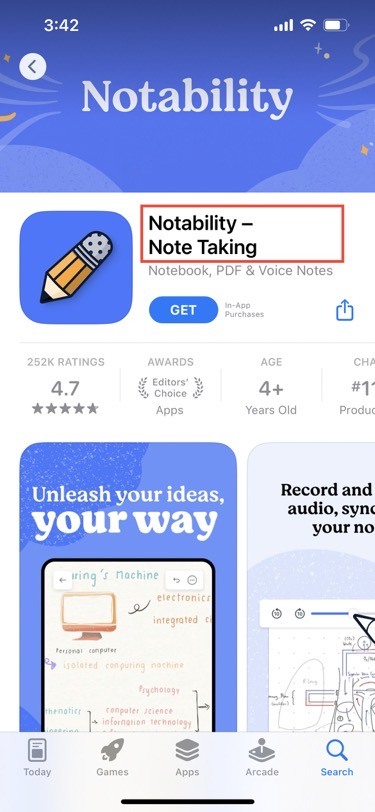
A good example of this combination can be the following Notability app – as you can see, it consists of its brand name Notability and a note-taking keyword that describes the essence of the app.
iOS Notability App Store’s listing: name
Source: App Store
Compared with other elements of the app’s marketing copy on the App Store, this is the only text element that remains to be displayed in full regardless of where the app is presented – a search results list or the app’s dedicated page on the App Store.
Moving on, from the app’s name to its subtitle – the second most important attribute of the app’s marketing copy that helps the algorithm to establish the app’s relevancy to specific search queries.
App subtitle
As indicative as the app’s name is, given the sheer volume of apps on the App Store, there is a need for more fields to serve as additional sources of information about the app and the subtitle is the most important of them.
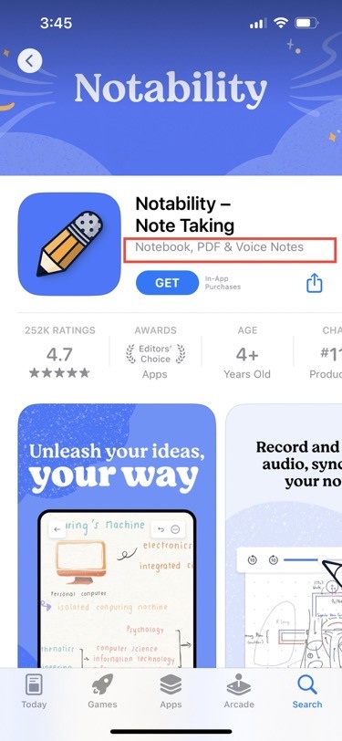
Its maximum length is 30 characters as well and it’s the ideal place to mention either more relevant keywords. Just like the app’s name, it can be truncated in various places on the App Store. Specifically in the Top Charts and the app’s listing in its categories, while it remains to be displayed in full in the search results.
iOS Notability app App Store’s listing: subtitle
Source: App Store
Contrary to the Google Play Store, keywords are important for the Apple App Store and it’s the topic of the next section.
Keywords
Among other attributes of the iOS app, this is the only one that is not displayed on the App Store and yet plays a vital role in its ranking. According to Apple’s guidelines, you are allowed to specify a 100-symbol-long set of keywords, including the spaces between words, to identify keywords that are relevant to the app.
One of the best App Store Optimization for iOS applications for keywords is app localization for multiple app markets – you can specify a unique set of keywords in a particular language. In certain countries, where two are more languages are in use, the best example is the US, the set of keywords specified for Latin America will be also in use for the US App Store.
And now, let’s talk about the attribute of the iOS App Store listing which doesn’t have a direct influence on the app’s ranking for keywords but still is crucial for the app’s Conversion ratio.
App description
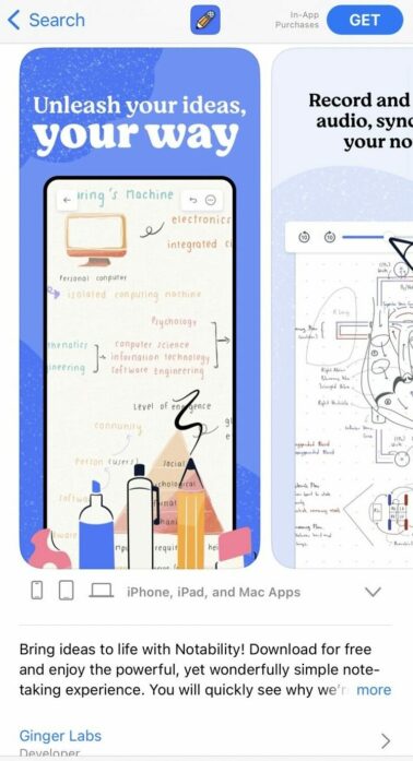
The first and foremost thing to remember about the iOS app’s description is that on mobile it gets truncated at the end of the third line. To view the rest app user needs to click on more, what he may or may not do and to increase the likelihood that she or he will, you need to deliver the most important part of the message about the app in the first sentence of its description.
iOS Notability app App Store’s listing: description on mobile
Source: App Store
The good iOS ASO practice is to include an app’s one or two most relevant keywords within the app’s description and build it in a way inviting people to read the remaining part that is hidden behind the more button.
Moving on to another component of the App Store marketing copy for the app that doesn’t move the app’s ranking needle one way or another but plays its role in increasing the app’s Conversion rate.
In-app purchases
In-app purchases are an app monetization tool introduced by Apple years ago. It allows app developers to generate revenue with the app offering its basic version for free and charging its users for extra features sold to them via in-app purchases.
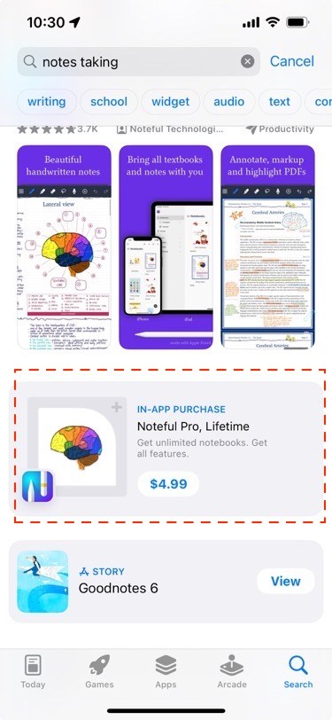
Even though the app may have as many in-app purchases as its development company wants, only 20 of them can be promoted and visible in Apple’s App Store search results. Think of these 20 in-app purchases as 20 extra ad spots to increase your iOS app’s visibility. All text of these spots is indexed and competes in the App Store search results with other apps for visibility.
To meet Apple’s guidelines as you promote your app’s in-app purchases (or IAP for short) you need to meet the following requirements:
- The name/title can be up to 30 characters – make sure to include one or two keywords relevant to the app the most
- The description can’t go above 45 characters
- The graphical representative of your IAPs should be in PNG / JPEG format and 1024×1024 px in size.
The message on the graphic and its description should be focused on explaining the IAP’s value and encouraging people to buy it. Generally speaking, in-app purchases allow you to both increase the visibility of your app and generate more revenue.
in-App purchase example
Source: App Store
Switching from the means to win extra visibility along with extra revenue to a special section on the App Store to get exposure before the app’s launch.
App Store pre-order section
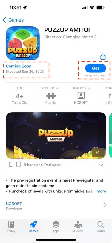
The App Store pre-order is a special section of the App Store dedicated to announcements of apps that will be released any time between 2 and 180 days since they are listed in this section. The section is available for both free and paid apps. Only apps that were never launched and not available in any other country are eligible for it.
The app’s pre-order page is visible in search results, the page has the app’s metadata on it, the release date. If app users are registered for this feature, they will get the app or game downloaded on their device, if they click “Get”, once it’s available, if not – they will get a notification inviting them to download it.
There is a dedicated section in the App Store Connect to provide information about the app’s pre-order page performance. The App Store pre-order is a great way to spark interest and create anticipation before the app is released on the App Store.
Example of an app’s pre-order listing
Source: App Store
Switching the gears, from the coming up section of the App Store to learn about the apps that will be released in the near future to the app store ratings and reviews that serve as a quality indicator to iOS app users.
App Store ratings and reviews
App ratings and reviews are one of the key indicators for app users when they consider what specific app to choose among multiple options. It’s obvious that it would be unethical to buy and submit fake reviews and ratings to sway the general sentiment to praise a particular app. Do not ever engage in such practice. The ethical way to approach using app reviews and ratings to improve your app’s ranking and increase its conversation rate is to remind your app users to leave a review, set a rating, or both at the right moments when they complete a certain action in the app or game.
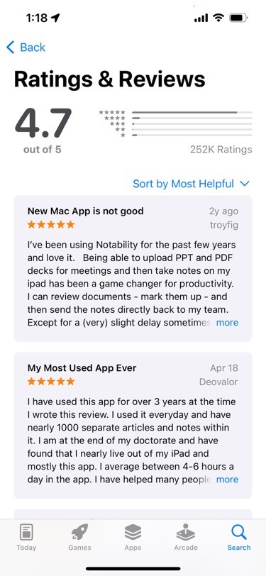
The App Store ranking algorithm factors in the average rating based on all ratings set for the app, as well as the total number of these ratings and reviews.
Notability app reviews and ratings
Source: App Store
Switching the gears, let’s review the graphical part of the app’s marketing copy that impacts the app’s Conversion rate – the ratio between people who view the app’s page and actually install the app.
List of Best ASO Tools and Agencies
App icon
On the App Store, the native traffic for your app splits between search and listing in categories, Top Charts, the Featured section, and pre-order pages. The app’s icon is a crucial visual element for so-called Browse traffic that is generated via all just mentioned listings of the app except in the search results, where the app’s screenshots and preview video take the main stage.
The app’s icon doesn’t influence its ranking but impacts the app’s Conversion rate. When people browse the App Store categories and check out its Top Charts, your app’s icon can stop them from skimming and entice them to click on your app to install.
There is no one-fits-all strategy for designing an icon for the app, the choice of elements and colors is always subjective. The app’s icon is a product of colors and geometrical shapes that represent the app and what identifies your app on the home screen of its future users.
Notability app’s icon
Source: App Store
The process of identifying what specific design of the app’s icon converts the best always involves A/B testing.
To design a superior icon for your app you should always consult with Apple’s guidelines.
Now, let’s unpack how the next most important graphical attribute of the app’s marketing copy on the App Store – screenshots help the app to convert better.
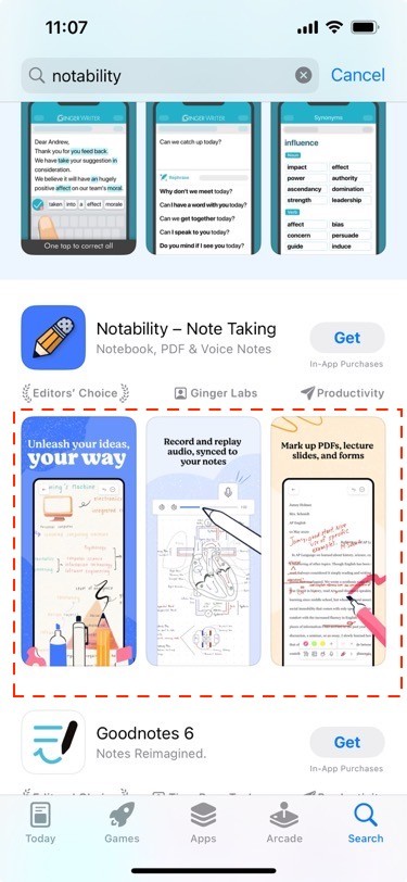
App Screenshots
The most prominent graphical element of the iOS app marketing copy people can see while they’re searching for apps on the App Store is screenshots. Choosing between the app’s description and its screenshots, Apple decided on the side of screenshots because they allow for explaining the app’s purpose more efficiently. A single image costs a thousand words, as the famous proverb says, and hence it is vital to make sure that your app’s screenshots tell the story of your app within the first three out of six available for the app.
Just like with the icon, the screenshots don’t play any role in iOS apps’ ranking on the App Store but they do impact the app’s Conversion rate. Starting with iOS 15, Apple launched the Product page optimizations tool in App Store Connect and it’s a great tool for launching A/B tests for the app’s screenshots and determining what set of these are the best conversion-wise.
Apple App Store app screenshots
Source: App Store
Apple’s guidelines and specifications for screenshots can be found here.
Finally, we’re moving on to the final graphical element of the app’s marketing copy on the App Store – a preview video.
App preview video
Among all the marketing assets the iOS app has on the App Store a preview video is the most effective in explaining the app and making a case for why app users should prefer this particular app. An important thing to remember is that a preview video is an optional asset iOS app marketers can upload for the app, once a video is uploaded, it is placed instead of the first app’s screenshot. If the video is horizontal it takes up all the space that is available on the screen for preview videos and screenshots.
The app’s preview video begins to play muted automatically right in the search results, allowing app users to become familiar with the app right away. The iTunes Connect allows you to upload up to three preview videos between 15 and 30 seconds long. Mobile games are the App Store category that benefits the most from using the preview video to introduce the gameplay to its potential users.
Given the limited size of the preview video, it’s important to build it around the following points:
- make sure you demonstrate how people can use the most useful feature of the app
- because the preview video is played muted, you need to add captions for the audio message you may have in it
- use A/B testing via the Product page optimization tool in iTunes Connect to identify the most engaging video that entices people to install your game or app
You can find here Apple’s guidance for creating a preview video for your iOS app.
There is one asset that iOS app marketers can take advantage of, even though they do not have any direct influence on it – the app’s exposure in the Featured section on the App Store.
Featured Apps section exposure
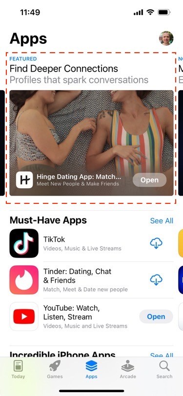
Naturally, when the app store hosts more than 1.6 million apps and the competition is fierce, some of those apps are destined to be remarkable and worthy of a separate section. A team of editors of the App Store reviews a constant stream of new iOS apps coming on the store and the growth of popularity of existing apps. The result of their work is apps featured in the Featured section.
The Featured section comes in three flavors:
- Editorial Stories – this section has the most prominent spot on the entire App Store, app users get to see the Today spot with apps right the moment they open the App Store app
- App or game of the day – this section hosts a lucky app or game that was chosen to be in the spotlight on that day
- Collections of daily lists – collections of apps or games that the App Store editorial team found to be worthy of the spot
The Featured section on the App Store
Source: App Store
Being featured in any of these three sections gives an app or game a big boost in performance. It does lead to a significant bump in downloads and increases the app or game’s chances to obtain loyal app users because of the expectations that the App Store editorial approval gives to it.
Key Takeaways
App Store Optimization is the leading app marketing technique to drive native traffic on the iOS App Store. It’s been perfected over the years and by now it provides a solid foundation for app marketers to increase the visibility of their apps on the App Store, find new users, and generate more revenue.
To do App Store Optimization for iOS you need to stick to the following principles:
- Conducting keyword research you need to identify a set of keywords to optimize multiple text assets of the app’s marketing copy
- A priority should be given to a handful of keywords that are relevant to the app the most
- The app’s name and subtitles are the most important text creatives to be focused on and the app’s screenshots + preview video have a significant impact on its Conversion rate.
- App Store Optimization for iOS is a long-term process that requires using ASO tools to conduct research and track the app’s performance visibility-wise on the App Store.


