What is mobile app localization
There can be a number of reasons why you, as an app developer or brand, would want to release the app on new markets. For starters, it is possible to simply reach a plateau of your app’s growth in a native market – you’ve been a successful app marketer and managed to connect your app with all people who could benefit from it. Great – now what?! The answer is – mobile app localization, but first let’s look at more examples.
If the competition on your native market is high but you see that in other countries there are many people who could benefit from your app and nobody else is meeting their needs. So you gotta release your app on that market(s), help people, and grow your user base there.
Having a few apps under your belt, you may have a hard time nursing a concept of a new app for your native market, but you’ve stumbled upon a market demand for the app market in another country. Again, this is the moment you should start thinking about building an app for that particular market.

All in all, to localize an app under any of these scenarios, you need a good understanding of what mobile app localization is, and this guide was put together to help you with that.
Cultural adaptation
It may sound strange and unexpected, but a mobile app localization process should always begin with an understanding of the culture of the country you want to release your app to. Such understanding implies— on top of translating the app to a proper language— studying what app design, images, colors, symbols, and other elements of the app’s visuals will match the preference and expectations of the target audience.
You may not realize it, but your perception of any app is based on all these factors, and to “speak the language”, to be on the same page with people of a country you want to release your app to, you need to conduct market research to choose the right elements.
App Store Optimization Buyer's Guide
Download our App Store Optimization Buyer’s Guide, covering all aspects of this essential app marketing technique to drive native traffic to your mobile app.
Let’s unpack each element starting with the language.
App’s language
The most obvious element of the app is its language, despite the fact that English is the most common language, people always prefer to interact with information in their native language and mobile apps isn’t an exception. To translate the app to a target language you need to hire a translation service company or use ChatGPT Pro latest model to generate an accurate authentic translation. The hardest part of any translation is to factor in all nuances such as dialects, idioms, slang, and tone. Any mistake made with these elements may backfire at your efforts to do a proper mobile app localization of your app to a specific country’s market.
The other important feature of the language to remember is directionality, as opposed to English, a number of languages are written from right to left, such as Hebrew, Urdu, Farsi, Arabic, and others. Length and formatting of the text is also important, because it takes a different number of words or symbols to convey the same message hence you may need to adjust your app’s layout. As you can see on the example below, symbols in different languages occupy different space and may require adjustments in an app’s interface.
A mobile app interface in English, Mandarin, and Farsi
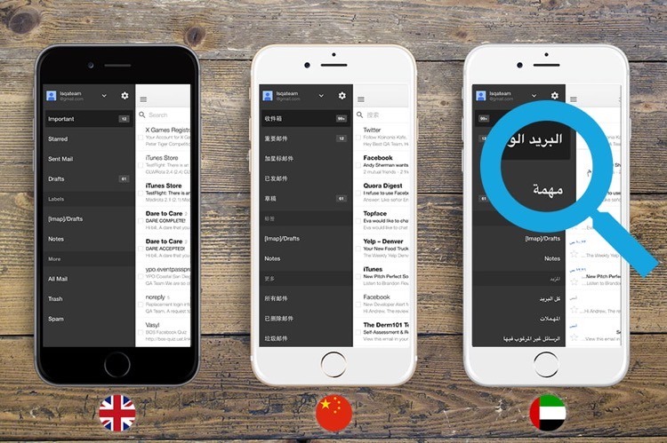
Source: Lvivity
Just like people strive to use apps in their native language, they may prefer different colors in the app, and hence this is the next component of a proper mobile app localization recipe.
Featured App Store Optimization Companies


App’s colors
The same colors have different meanings and connotations and using these colors without considering what specific color means for people in your target market may trigger a reaction you don’t expect. For instance, the red color is a color of luck and happiness in China, but it definitely signals a danger in the Western culture. Colors also play an important role in making sure people with visual impairments or color blindness can interact with your app.
Both Apple and Google provide accessibility settings to adjust the app’s color palette to app users’ impaired needs but as you choose a color palette for your app, you need to make sure that the app’s interface will continue to be easy-to-use once the app is switched to the Accessibility mode.
Example of classic versus inverted colors of the iOS app interface
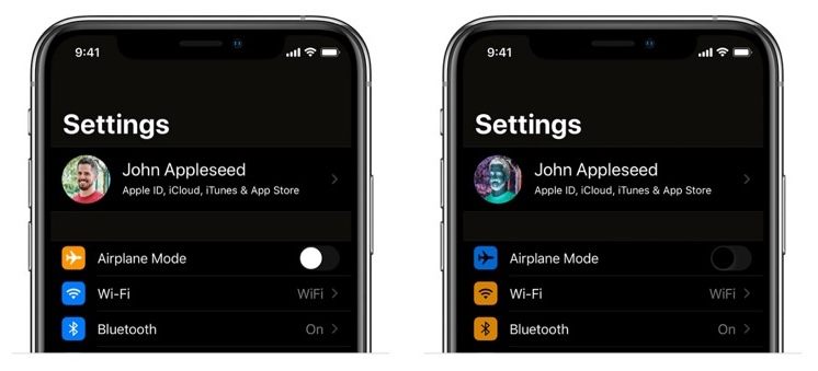
Source: Linearity
Generally speaking, as we describe in the App Store & Google Play visual assets optimization guide, the app’s color palette ideally should consists of 2-3 colors, which will be both beneficial for a regular app user and the one who needs Accessibility settings for its colors.
Switching from the language and colors to symbols that the mobile app’s interface features and why they are the next component of your mobile app localization recipe.
App’s symbols
Symbols have an important role in our lives, in fact, we’re surrounded by symbols all the time, they help us to make sense of this world and we use them to highlight important information. Symbols are graphical representations of concepts, objects, or actions. By using a particular symbol in your app for an audience in a target market you convey a message – both explicitly and implicitly.
To go back to our example with Japanese culture versus the Western culture, a check mark is a symbol of approval or completion in the West, but for Japanese people it is a symbol of error or rejection. As you can see from this example, the difference between meaning of the same symbols in different cultures can be really striking,
You need to be really careful and thoughtful with what symbols you include in your app’s interface, when you want to do a mobile app localization for a market in a particular country, to avoid symbols that may be ambiguous, confusing, or inappropriate. It’s especially applicable to mobile games, given how many graphical elements they typically have and so you may consider adopting not only the games user interface but its levels as well.
A good example of a custom approach manifestation in using symbols in apps’ app store’s marketing copy is the Evolve: Self-Care & Meditation app and its listing on the Google Play US versus Google Play Japan. As you can see, the US version highlights the fact that the app was recognized as Best App for Personal Growth by the Google Play US editorial team and the overall tone of all messages is focused on an individual.
On the other hand, the screenshots for Google Play Japan are focused around the content of the app, they do not tell you what you should do in the app. It’s a great example of how the app’s team factored in the cultural difference between US and Japan in the app’s visuals.
Evolve: Self-Care & Meditation Android app screenshots: Google Play Us vs. Google Play Japan
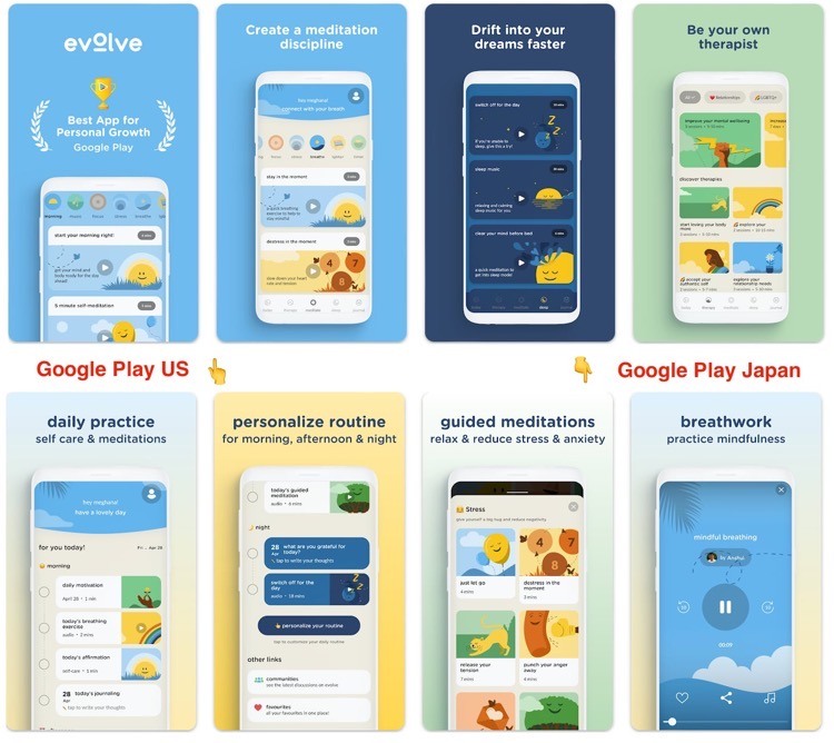
Source: Google Play store
And now let’s switch to images and how they can be tweaked to account for a cultural difference when it comes to localizing the app’s images for a local version of the Google Play or the App Store for that matter.
App’s images
Images are the core of our perception of a mobile app, they can enhance the user experience, attract attention, or evoke emotions. But you need to remember that they also reflect culture values, norms, and preferences. It should also be on your radar to use images that are suitable and respectful to your target audience, make sure you don’t use the ones that may be irrelevant, misleading, or offensive.
Using the same example of the Evolve app, the following image highlights the difference between the app’s icon that the app’s team developed for Google Play US and Google Play Japan. Rainbow as a symbol has a bigger significance in the American culture and hence it doesn’t require as literal depiction as you can see with its Japanese version. The visual difference maybe subtle but it allows to communicate the app’s message to take care of your mental health and evolve as an individual better.
Evolve: Self-Care & Meditation Android app icon: Google Play Us vs. Google Play Japan
![]()
Source: Google Play store
Now, let’s review how all these text and graphical elements should be put together to localize the app for a particular country or regional market.
App’s layout
Following the theme of significance of what symbols are used in the app’s interface and its marketing copy on the App Store or Google Play, it’s important to understand preferences of different cultures for how much information and details are presented in the app’s interface and what interface may be perceived as a cluttered one in certain cultures.
One of the best examples of how mobile app interface can be adopted for different countries and their cultural preferences is the Netflix app. The app is available in more than 190 countries and to appeal visually to people in such diverse number of cultures Netflix team pays special attention to the app’s layout. For example, in Japan Netflix’s app layout is built on a vertical scroll menu and mimics the style of manga. If you happens to be French and you open the Netflix’s app you’re welcomed with a red and white color scheme to match the country’s flag colors and the same goes for other countries where the video streaming platform is available.
As much as the elements of the app’s interface are important for how the app will be perceived in various countries, following local regulations is yet another challenge you need to be aware of and make sure your app will comply.
Local regulations and guidelines
For app developers and publishers to distribute their apps legally and ethically in different markets they need to comply with local regulations. Such regulations vary on a country or region and they may cover such aspects as privacy, data protection, consumer rights, content restrictions, taxes, and more. There is a number of reasons why local regulations are significant:
- They help to protect app users’ right on privacy, their personal information, safety, and more;
- They help to avoid legal risks, penalties, and bans by complying with the laws and standards of the country or region where the app is published;
- To respect cultural values of the target audience;
- To increase user satisfaction and retention.
When it comes to regulations of the Internet, the European Union is a clear leader. In EU, app developers and publishers have to comply with General Data Protection Regulation (aka GDPR). This regulation set the rules for how personal data of European Union citizens and residents is collected, processed, stored, and shared.
To this day, there aren’t any state-wide internet regulations for app developers and publishers in the United States. The closest equivalents are California Consumer Privacy Act (aka CCPA) and California Privacy Rights Act. These acts are comprehensive data privacy protection laws that regulate how businesses must handle the personally identifiable information of California residents.
Another example of a local regulation is the Canadian Personal Information Protection and Electronic Documents Act (aka PIPEDA). It’s a federal law that sets the rules and principles the collection, use, and disclosure of personal information in the course of commercial activities.
The special case is the Chinese market, where app developers and publishers have to comply with the Cybersecurity Law, which came into force on June, 2017, it regulates the security and management of network information and activities. Other Chinese regulations that applicable to mobile app development are the Administrative Provision on Mobile Internet Applications Information Services, The Personal Information Protection Law (aka PIPL), and The Data Security Law (aka DSL).
Next up on the list are mobile app elements that are often overlooked by app developers – date, time, and number formats.

Date, time, and number formats
There are different standards for how to display date, time, number formats in different countries and hence you need to make sure your app uses the right ones for a particular app market.
There are three internationally accepted formats of a date displaying:
- DMY: Day-Month-Year, such as 31/12/2022 or 31-12-2022. This is used by most countries in Europe, Africa, Latin America, and Asia.
- YMD: Year-Month-Day, such as 2022/12/31 or 2022-12-31. This is used by China, Japan, South Korea, Taiwan, Hungary, Lithuania, Mongolia, and some other countries in Asia and Europe. It is also the international standard ISO 8601 format.
- MDY: Month-Day-Year, such as 12/31/2022 or 12-31-2022. This is used by the United States, some U.S. island territories, and a few other countries.
Matching a date displaying standard with a particular app market is especially important for e-commerce apps with a products shipping & delivery function, where date display confusion will be a serious issue for the app’s functioning. It is also important for apps, built on the subscription model that implies changing the app users periodically and storing an invoice history.
When it comes to displaying time in the app, this is what you need to remember:
- The 12-hour clock system is used by most English-speaking countries, such as the United States, Canada, United Kingdom, Australia, and New Zealand, as well as some countries in Latin America, Africa, and Asia.
- The 24-hour clock one is widely adopted in Europe, Africa, Asia, Oceania, as well as some counties in Latin America.
- When you localize your app to a particular app market you may need to adjust the time in the app to a different time zone or use
And the last format of displaying information in the app to consider – numbers. Some of the aspects that differ in different countries are:
- The character used for the “decimal separator“, which separates the integer and fractional parts of a number. For example, some countries use a comma (,) while others use a dot (.).
- The character used for the “thousands separator“, which groups digits in large numbers for readability. For example, some countries use a space ( ) while others use a comma (,) or a dot (.).
- The “digit grouping pattern“, which determines how many digits are grouped together by the thousands separator. For example, some countries use groups of three digits, while others use groups of four or two digits.
- The “sign position“, which determines where the negative or positive sign is placed relative to the number. For example, some countries use a prefix sign (- or +) while others use parentheses ().
- The “currency symbol“, which indicates the unit of currency for the number. For example, some countries use a symbol like $ or € while others use a code like USD or EUR.
When all above-mentioned aspects of a mobile app localization process are addressed, it’s time to run localization testing to make sure the app complies all requirements and this is the topic of the next chapter.
Mobile app localization testing
Testing is the final component on the list for a mobile app to be localized for a specific country or region. It involves verifying if the app’s content, layout, functionality are compatible with a specific market.
To conduct a proper localization testing you need to follow these steps:
- Identification of target languages and regions for the app;
- Preparation of the app for localization – you need to identify all components of the app that require localization;
- Translation and localization of all identified components;
- Testing of the app on real devices and settings;
- Collection and analysis of a feedback from all users and testers.
Key takeaways
To release a version of your mobile app on a new market you need to do mobile app localization properly. The process implies making sure your app checks all these boxes:
- All text, including embedded into graphics is translated on a target language and this translation includes a proper translation of all idioms and slang expressions;
- The app’s interface is adopted for a particular language, with respect to all specific requirements for the interface textual elements location;
- The app’s color palette consists of colors that will be welcomed by the app’s audience on a target market;
- All symbols in the app aren’t ambiguous and can not be interpreted as harmful to the target audience;
- The app’s complies with all local regulations and laws;
- Only proper date, time, and number formats are used in the app;
- The app has successfully gone through rigorous localization testing process.