Mobile marketing trends are always changing. To ensure your game’s success in this ever-changing mobile landscape, it is essential to understand the emerging creative trends and test different visual elements on your app product page. For instance, should you include a preview video to your store listing? Or, which icon palette is popular in your category? To uncover such insights, it is interesting to see what other games in your category are doing.
AppTweak analyzes the top apps and games in each category on the App Store and Google Play to determine current metadata trends. In this article, based on Apptweak’s data, we had a look at some of the popular creative trends adapted by the leading games in the Casual, Adventure, Simulation, and Action categories in the US App Store.
Screenshot and preview video trends
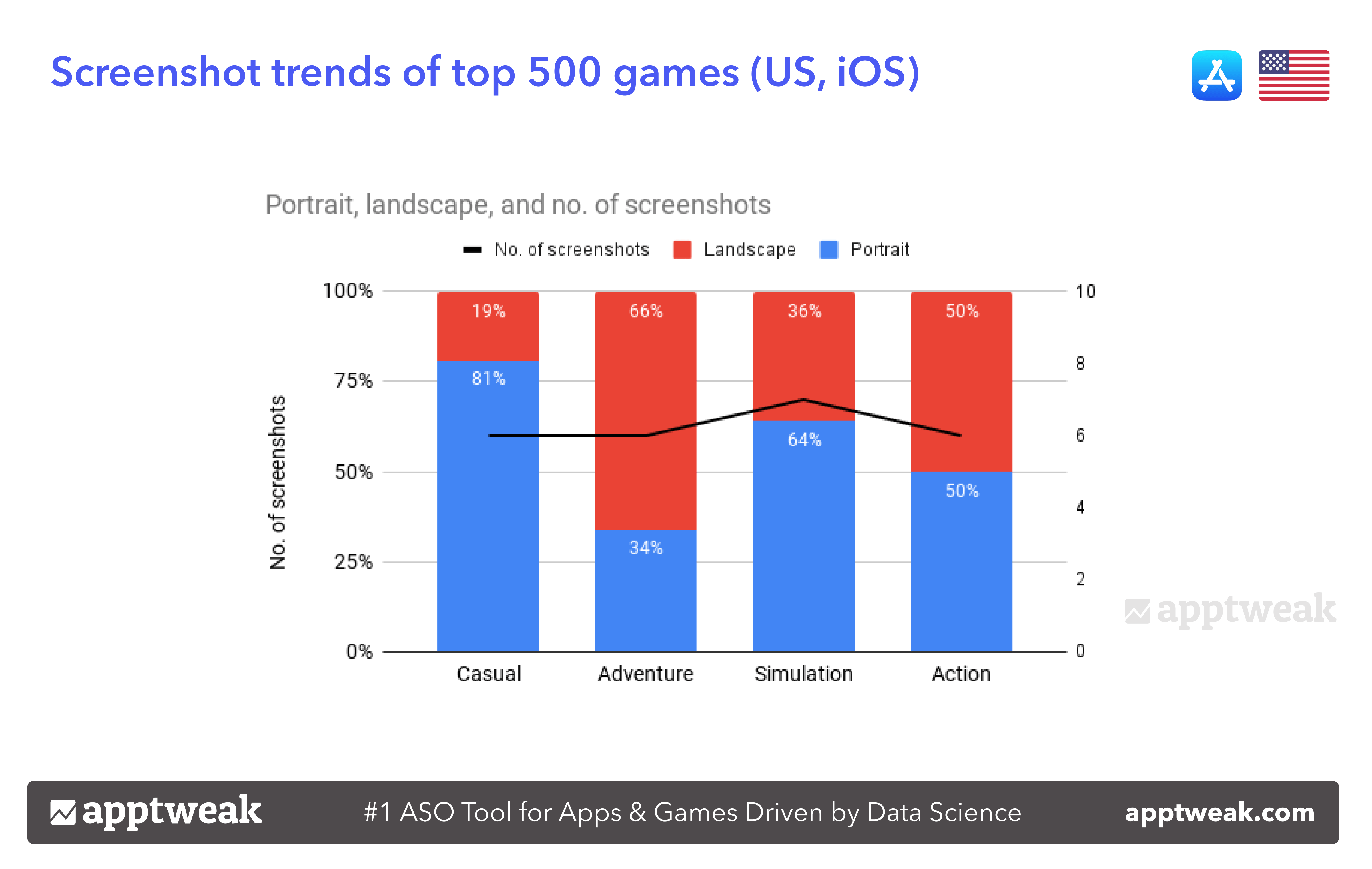
On the App Store, game developers can add up to 10 screenshots to store listings. We found that the top 500 games in the Action, Casual, and Adventure categories added, on average, 6 screenshots to their store listing in the App Store (US). With 7 screenshots on average, the Simulation category leads in terms of the number of screenshots among the four categories.
Number of screenshots & screenshot orientation of top 500 games in Action, Adventure, Casual, and Simulation categories in the App Store, US
Click on image for full size
Source: AppTweak
Choosing your mobile game’s screenshot orientation largely depends on your gameplay and the device type. In the given graph, we see that both in the Casual (81%) and Simulation categories (64%), maximum games use portrait screenshots over landscape ones. On the other hand, a lot of Adventure games prefer to display their screenshots in landscape mode (66%). Interestingly, there is a 50–50 distribution of games in the Action category that employ both landscape and portrait screenshots to show their gameplay.
👉 Discover the top App Store creative trends in 2022
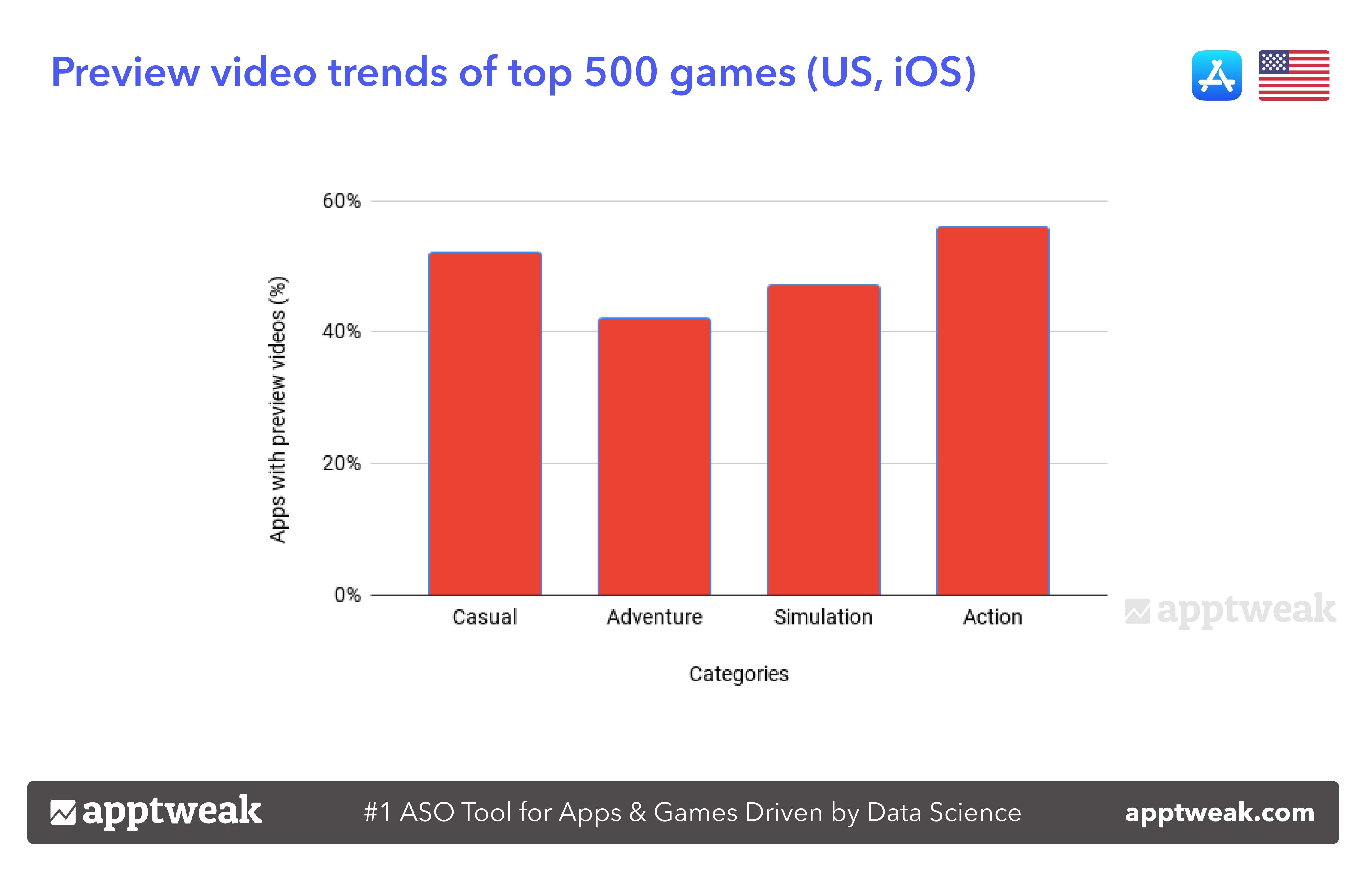
With regard to preview videos, we see that most games in the Action (56%) and Casual (52%) categories have employed a video in their store listing in the US (iOS). On the other hand, a lesser percentage of top games in the Adventure (42%) and Simulation (47%) categories have used a preview video in their listing.
Preview video trends of top 500 games in Action, Adventure, Casual, and Simulation categories in the App Store, US
Click on image for full size
Source: AppTweak
Game icon trends
To catch the eye of users in the increasingly competitive mobile gaming landscape, publishers have to pay attention to craft a converting app icon. Before designing your gaming app icon, it is a good idea to look at the top games in your category and understand the current trends. Specific color palettes are more dominant in some categories, while others are more varied.

Maximize App Growth with #1 App Store Optimization Company
Expand app store reach, increase downloads, boost engagement, lower acquisition costs & achieve higher user LTV with our leading ASO services & technology
Contact Us TodayWith AppTweak’s Metadata Benchmarks, we looked at the icons of the top games categories to get a quick overview of the main colors and elements used.
In our analysis of the icon color palettes, we found the dominance of three main colors – black, brown, and white – in the Action category. About 19.5% of publishers in the Action category include black in their icons. When we look closer at the different icons, we see that not all games use black as their main color, but they do include bold colors to make the gameplay stand out more. Shades of blue are also common to represent icon colors in this category. Also, icons tend to display characters (both realistic and animated) with intense emotions, such as clenched teeth, angry faces, or characters wielding weapons. Typically, games in this category draw on the power of faces to showcase different actions.
Icon collage of top 50 games in the Action category in the US (iOS). The icon color palette has a dominance of black and brown.
Click on image for full size
Source: AppTweak
Games in the Casual category opt for shades of black (19.5%) and white (14.5%), with some employing ivory and pink (red) shades as well. Casual mobile games exhibit more friendly, cartoon characters in their icons to entice players.
Icon collage of top 50 games in the Casual category in the US (iOS). Games in this category adopt mostly black and white to depict their icons. There’s also an abundance of pink (red) shades used in the icons.
Click on image for full size
Source: AppTweak
Much like Action games, the top Adventure games in the App Store (US) employ more of black and dark brown in their icons. Games in this category tend to show immersive worlds, interesting characters, or expressive faces in their icons to engage users.
Icon collage of top 50 games in the Adventure category in the US (iOS). Black and brown make up the icon color palette mostly.
Click on image for full size
Source: AppTweak
On the other hand, Simulation games use more white and skin-toned colors in their icons. Similar to other games categories, we see varied shades of blue. Typically, the icons display characters simulating some real-life situations, such as performing a task, managing schedules, trying new recipes, face make-up, etc.
Icon collage of top 50 games in the Simulation category in the US (iOS). Games adopt skin tones and white shades to reflect their gameplay.
Click on image for full size
Source: AppTweak
Metadata Update Frequency
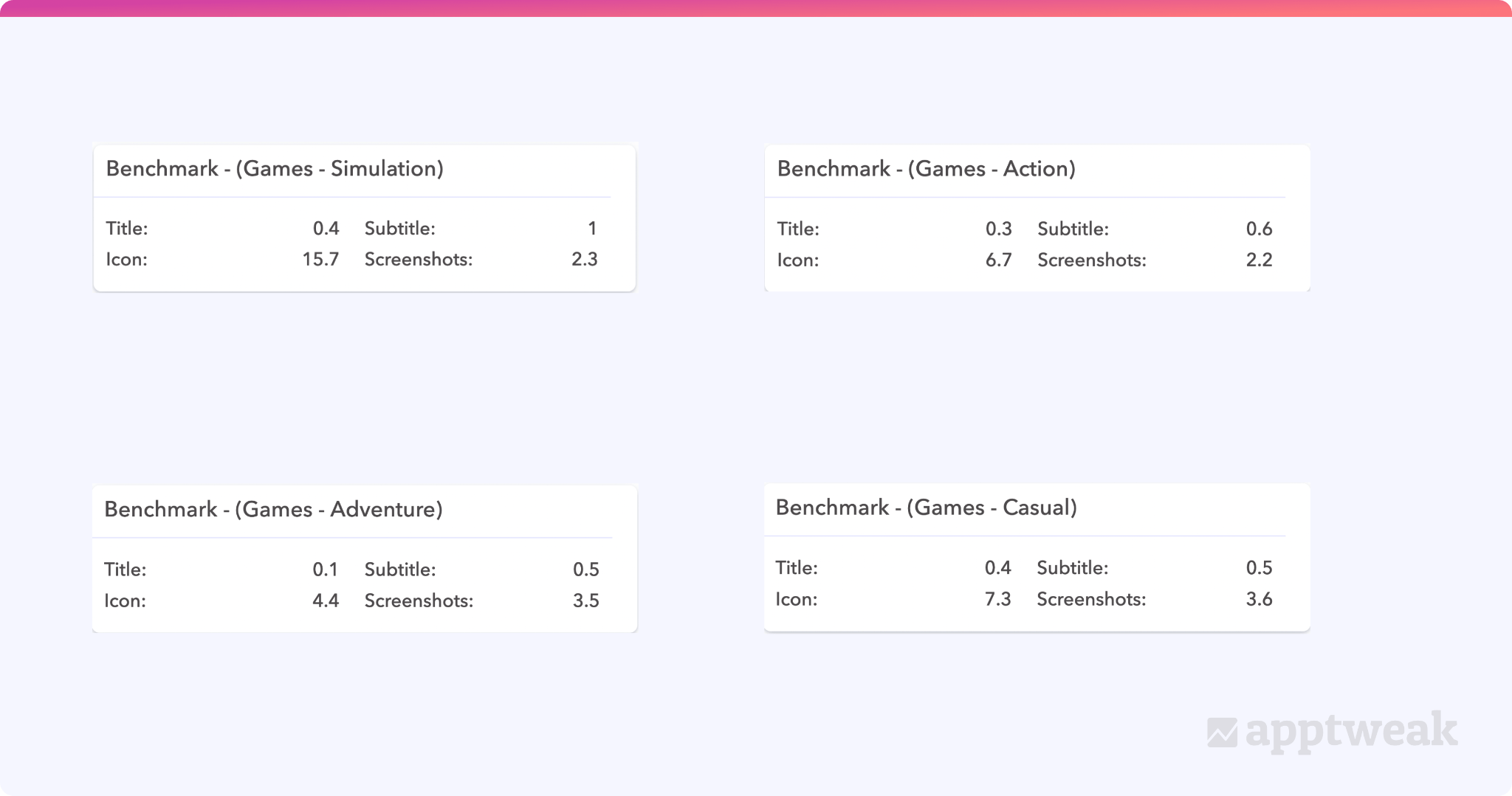
It is important to look at how often your competitors update their metadata elements, so that you can compare your game’s update frequency with your competitor’s. Using AppTweak’s Update Frequency Benchmark, we have outlined the metadata update frequency of the top 10 games in the leading categories in the US App Store over the past year.
Among the four categories, Simulation games have made the most updates in terms of icon (as many as 15.7 times), while Casual games have carried out the maximum updates in terms of screenshots (3.6 times). Also, interesting to note is that all these categories tend to focus on updating their icons more frequently than their screenshots. The top 10 games in each category seem to be more reluctant to update their title in the App Store. The top games in the Simulation category changed their subtitles on average once over the past year.
Looking at such combinations can help you understand what your competitors or top apps/games in your category are doing.
Metadata frequency updates over the past year by top games categories in the App Store (US)
Click on image for full size
Source: AppTweak
Conclusion
Gaming apps are the most competitive categories in the app stores. To get users’ attention among thousands of other available apps, mobile games have the scope to update their icons and other creative assets in different ways. Seasonal updates of icons and A/B testing your app visual assets are great ways to evaluate how your app creatives are performing. But before you go on to design your app icon or test a screenshot or video, take a look at what your competitors are doing to their icons, which colors are trending in your category, how frequently your competitors are updating their metadata elements, and so on.
It is essential to benchmark the competition and track what similar games are doing in order to stand out from them as well as to ensure some design uniformity. Certain patterns or color schemes work better in some categories than others. Therefore, game developers need to keep this in mind while creating their gaming app icons.