In an increasingly competitive world, with a solution for every need, one key concept remains central: the user experience quality.
Most companies, nowadays, have the possibility and capability to create great products or offer great services. In competitive markets, the only way to differentiate from the competition is to provide an amazing experience to our clients. This is true for almost any kind of service and product, from cars to food, electronic devices, consulting services, and of course, also for mobile apps.
Just think about how many options are available when searching for a navigation app, a dating app, or a training app. For each of our needs, there are countless options available. And of course, we tend to try those that are showing up first in the search results (oh yeah, your ranking also serves as a credibility factor), or offer a discount for new users, but also have good reviews.
Eventually, though, users stick with those services with a great, unique, and amazing customer experience.
In the specific case of mobile apps, the customer experience begins with the user onboarding, something that way too often is overlooked by app developers and product managers.
The user onboarding is the first touchpoint that a new user (probably acquired with an expensive Paid UA campaign) has with our mobile app. Do you remember that old saying “First impression lasts”? We believe this is very true, especially for mobile apps.
Given the importance of user onboarding, which team should be responsible for it?
Before answering this question, let’s analyze the main advantages of user onboarding, dividing them into 2 categories: product and marketing.
3 benefits of user onboarding from a product point of view
- WELCOME, MY FRIEND!
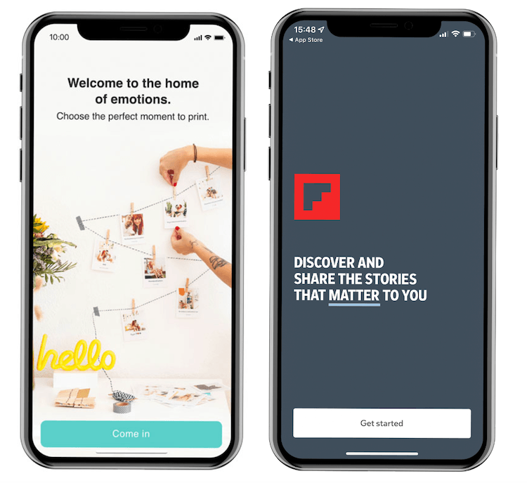
A well-done user onboarding is an opportunity to welcome new users to our app, and thank them for choosing our service. It’s nothing special, but a warm welcome is a sign of respect and gratitude.
PhotoSì, one of our partners, welcomes its users to the “house of emotions”, while Flipboard uses a strong claim.
- EXPLAIN MAIN FEATURES
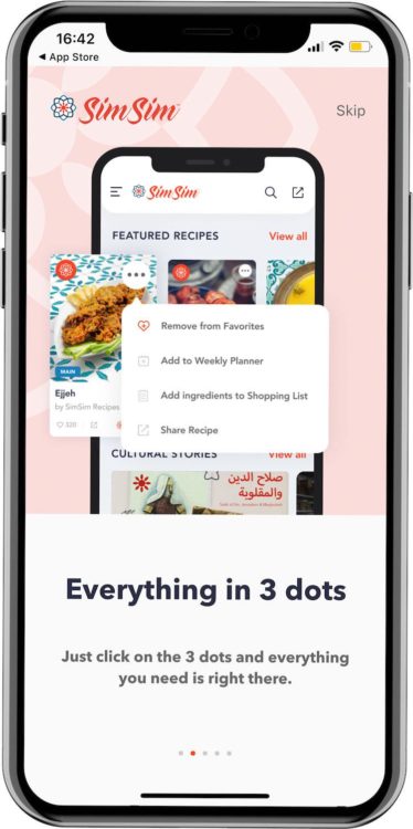
A good onboarding can help new users move the first steps into the app. Remember, our product is not as clear for the users as it is for us. We see our app every day. We know perfectly how it works, and we might mistakenly think that it’s the same for our users. This, however, couldn’t be farther from the truth. Users don’t have time to understand a new product. We have an opportunity, though, to help them understand what to do in our mobile app by showing them the main features and guiding them to what we want them to do.
There must be a reason why instruction manuals still exist, right? 🙂
Ultimate App Growth Guide 2025
Boost your app’s success with the Ultimate App Growth Guide! 🚀 Expert insights, proven strategies & must-know tips. Download now!
Master app growthSimSim (another partner of ours) explains the app features in the onboarding
- PREVENT UNINSTALLS
As mentioned earlier, the first impression lasts. In the case of mobile apps, we can say that a first (good) session lasts as well. This means that a good onboarding can help decrease the number of users that delete the app right after downloading it because they “just don’t get it”.
It is reported that 25% of users uninstall the app after one session and that 1 in every 2 apps installed is deleted within 30 days (source AppsFlyer). This means we don’t have too much time to convince a user about how good our product is. That’s why it’s important to start with a great user onboarding experience.
3 benefits of the user onboarding from a marketing point of view
- REQUEST PRIVACY POLICY, ATT, AND OTHER PERMISSIONS
The past few years have seen an increased sensibility in regard to privacy and user data protection. First with the GDPR regulations, then with the (in)famous ATT and iOS14 controversy, which by now – hopefully – everyone in the mobile industry is familiar with (if not, we got it covered for you in this infographic).
This increasing attention to user data forced app developers to request users to opt-in for tracking and accept privacy policies.
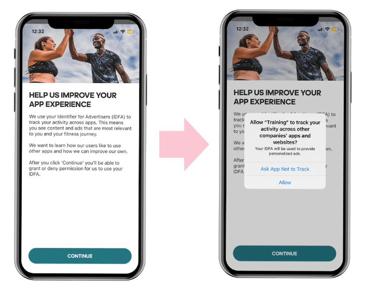
All those requests usually need to be shown in the first session, right after the download, and are sometimes mandatory to use the app. In this case, having a user onboarding can help us create pre-permission screens where we explain the reason why the users should allow us to track them and share their data with us.
Privacy policy and ATT are not the only requests we might need to ask our users. For some products, we might need access to the users’ locations, or to the contact lists. Some other mobile apps will require access to a microphone and camera. We can include those requests in the user onboarding, but always remember to specify – with a pre-authorization screen – the reason why the user should say yes, or as the marketing gurus call it the WIIFM – What’s in it for me.
Adidas Runtastic is using a Pre-authorization screen before showing the ATT prompt. On the first page, they explain what an IDFA is and why it’s important to create a better app experience
- INCREASE PUSH NOTIFICATION OPT-IN RATES
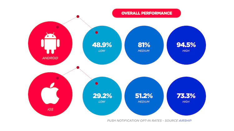
There is no secret that push notifications are the most powerful tool for mobile marketers to increase user retention and engagement. It is also well known that – when it comes to iOS – the opt-in rate is quite low, making a big part of the users “unreachable”.
Push notification opt-in rates
Source Airship
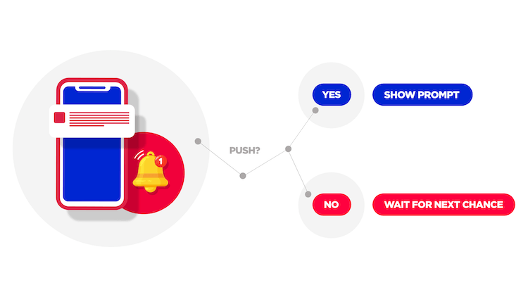
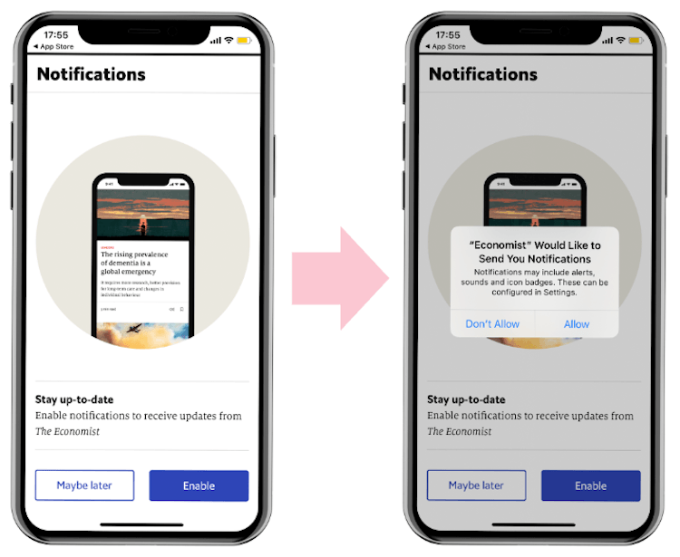
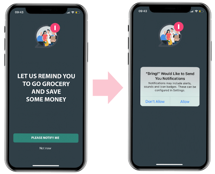
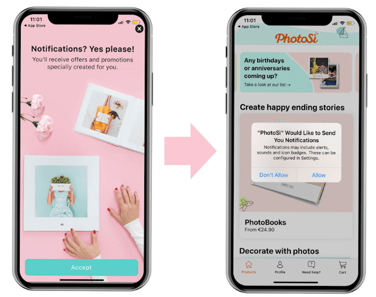
Once again, having a properly optimized user onboarding can help limit this problem, by adding a pre-authorization screen and asking the users if they would like to receive communications from us. If they say yes, we can show the official Apple opt-in prompt. If not, we can choose to show it later (and we should).
We need, in fact, to consider that if users say “no” to Apple’s official prompt, this can’t be shown again. The only way for users to opt-in for push notifications, in this case, would be to enable them in their phone setting. Pretty unlikely, isn’t it?
Also for the push optimization pre-authorization page, there is one golden rule to follow: be clear with the reason why the users should accept to be bothered by PNs. That’s crucial to increase the opt-in rates.
It is also important to consider that mobile marketers don’t need to reinvent the wheel. There are already companies out there doing a great job!
The Economist
Bring!
PhotoSì
- COLLECT USERS’ PREFERENCES
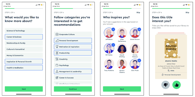
Information and data are everything in a performance-driven industry. The more we know about our users (data points and preferences), the easiest it can be for us to communicate with them, suggest their favorite products, bring them back to the app, etc…. We can collect user preferences in two ways, passively and actively.
The passive way is by analyzing the user’s in-app behavior, how they interact with the app, what they watch/buy/play etc. The second way is to actively ask for this information.
For example, consider a fashion shopping app where users can choose from different brands and styles. In this case, we might ask them what style represents them, what the brands they like the most, or even their sizes – so that we can create a personalized in-app experience.
The same reasoning is valid for news, food delivery, content streaming apps, and many others, that could use personalization to increase user engagement.
In this example, Blinkist is asking during the onboarding what type of content the user would like to know. Notice the language: it’s all about the user’s interest “What would you like to see?”
OK then, but who should take care of creating a good onboarding?
Considering its several benefits, the user onboarding creation should be a common effort between the product and marketing team (both Paid UA and mobile CRM).
The product team should definitely take the lead in creating a user onboarding that is in line with the in-app experience. While the marketing team should support in giving inputs on which permissions request we should show to the users, when, and with which priority.
Without such cooperation, we might be failing to create a user onboarding that takes into account – with equal importance – user experience efficiency and marketing permissions effectiveness. In fact, most product managers with no access to data and campaigns won’t feel the importance of having a high ATT opt-in rate, for example. While at the same time, marketers, without the help of a PM, would probably just show several permissions requests at once without worrying about users’ experience.
Only when Developers, Product Managers, User Acquisition experts, and Mobile CRM teams work together, they can create a user onboarding that can accomplish the goal of giving the users a great first session experience, while helping the marketing team collect important permissions and information about the users.
Final considerations to bulletproof your mobile user onboarding
Up to this point, it should be clear how important the first seconds after a user opens the app for the first time. Yet, in the first 15 seconds of every new experience, people are lazy, vain, and selfish. Behance’s founder Scott Belsky is talking about this concept in this article, highlighting the importance of designing a first-mile user experience that gets the users to The Zone (and yields deep engagement over time).
To help achieve this goal, we put together a list of effective advice that can be applied to different types of apps and products.
- Create a seamless experience: user onboarding is the first step of a great user experience, and it’s not a tool intended to serve just our needs. It needs to be useful for the users as well – otherwise, it would be better to send them directly to the home page right after the download. The main objective is to guide new users from the moment they open the app for the first time. We want to support them when they actually start using the features, giving them all the valuable information, while collecting important data points.
- WIIFM – What’s in it for me?: always give the users a clear and valid reason to perform an action. Mobile marketers should always ask themselves these questions:
- What are the advantages of creating an account?
- Why should they accept receiving push notifications?
- What’s in it for them if they share their location with us?
- Find the WIIFM in the app features: often the best reasons are inherent to the features themselves, so there is the opportunity to request the permissions while actually explaining the best app functionality.
- Be polite, and welcome the users: a welcome page is an opportunity to thank the users for choosing us, to give them a sneak peek of what to expect in the app, and to prepare them for the requests that they will be asked.
- Be yourself: use your tone of voice throughout the entire user onboarding, from the welcome page to the last request. It’s a great chance to present your brand to new users.
- Don’t force the users: always give the users the possibility to skip the onboarding process. It is fair to allow those who wish to do so to go directly to the app. It’s important to keep in mind that when people are forced to do something, they usually decide to leave.
- Use pre-permission screens before the official prompts for requests: this will give marketers the opportunity first of all to add a solid WIIFM, but also to show the official prompts only to people who are willing to accept. If people say no to pre-screen, we can show the request again at another point in the user experience.
- Consider contextual onboarding: recent trends show more products dividing onboarding into bits and pieces that people can choose and put in the right order according to their needs. This is done so to show the right message to the right user at the right time.
- Eat, sleep, TEST, repeat: as for most app marketing activities, the main rule is to test the assumptions. If asking for PNs opt-in during the onboarding is not compatible with our user journey, then we should show the prompt in a different moment of the app experience. Test different WIIFM, different onboarding lengths, tone of voice, and the list goes on. The possibilities for improvement are countless, and they can be exploited only with testing.
Are you interested in boosting your current mobile app user onboarding and increasing overall opt-ins and engagement? Get in contact with Lorenzo Rossi, REPLUG Co-founder & Head of Growth, at lorenzo@rplg.io


