This article was first published on Hedgehog Lab blog.
The Apple Watch is rapidly approaching its fourth birthday, yet there’s still the sense that smart device has yet to reach its full potential. There is still a reticence on the part of many developers to get their heads around the quirks and intricacies of Watch development, not least the UX challenges it poses. To prove that it’s really nothing to be afraid of, hedgehog lab’s Senior iOS Developer, Luke Sadler, set about developing a working prototype from scratch.
Since its launch in 2015, the Apple Watch has gone from strength to strength with its luxe square face appearing on millions of wrists in the last four years.
With over 40m of the smartwatch devices now in circulation, it’s long overdue for brands and businesses to be thinking seriously about how they take advantage of the screen real estate on their user’s wrists.
However, there’s still a reluctance from organisations about capitalising on this innovative new channel and a confusion about how best to utilise it. But this shouldn’t stand in the way of giving it a go and, in reality, it’s not as hard as it looks to get a functioning Apple Watch app up and running.
To prove it, I settled down in front of my MacBook Pro to hammer out a workable Apple Watch prototype within 24 hours. Here’s what we learned.
Choose your project wisely
First things first, you’ve got to think about whether the pain you’re trying to address can actually be solved by an Apple Watch app. For us, our approach was defined by the fact that we were building a proof of concept for a major corporate partner so we had free rein with what we put together. For your project, the ideation process might be significantly more involved.
It might be tempting to slap extra notifications or analytics onto the Apple Watch to complement your app but think carefully about whether this is actually needed. Users are bombarded with more information than ever before, so don’t waste their time with yet another distraction that they’re never going to use.
According to Google statistics from late 2016, the average smartphone user has around 35 apps installed on their phone at any one time, and that’s not to mention the plethora of other distractions out there in the modern world. It’s hard enough keeping on top of all those apps, so make sure your Watch app has a genuine reason to exist.
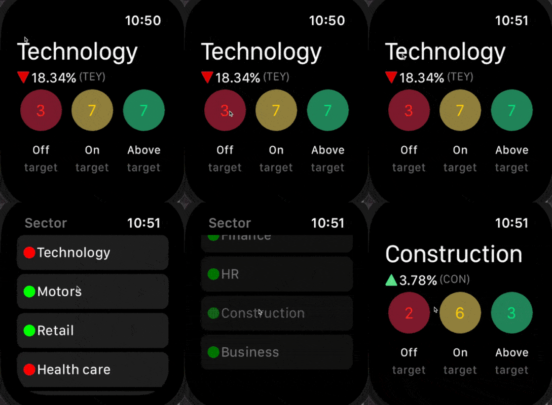
For our proof-of-concept, we created a simple dashboard to provide managers and executives with at-a-glance business KPIs for when they’re out in the field or travelling. A straightforward, three-tiered set of key information points that would save them from having to get out their laptop or unlock their iPad.
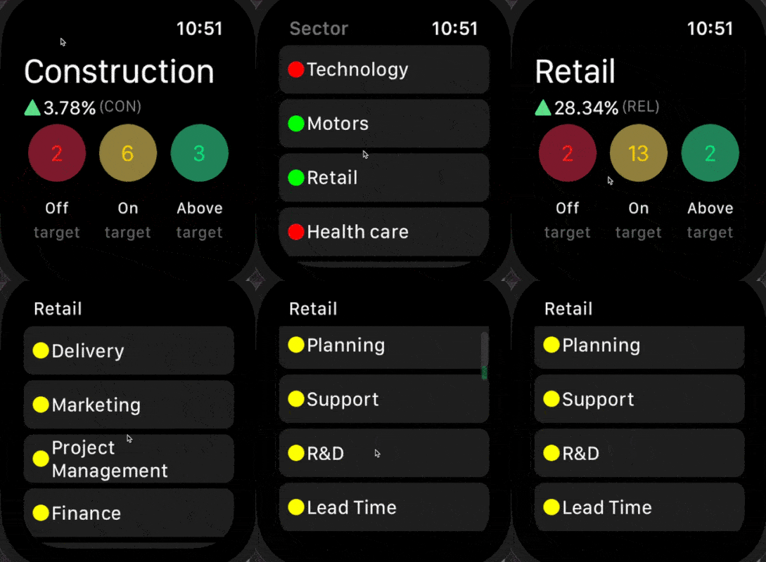
Changing the sector in our Watch prototype to look at different KPIs.
The prototype combined two of the primary benefits of the Apple Watch: immediacy and convenience. It also provided a straightforward crash course in watchOS development.
Limitations can be a good thing
Building for Apple Watch is a different beast compared to developing for iOS, it’s not just a case of stripped back features and lower fidelity assets. It’s not just iOS development simplified either, although you will need to develop an iOS app for your Watch app to function. It has its own intricacies and quirks that will take a little time to get your head around.
The first and most obvious is the reduced screen real estate available. First-time watchOS developers have to quickly get used to doing as much as they can with significantly fewer resources available than they’re used to.
However, like a painter with a limited palette, developing for the Apple Watch requires creativity to work within the limitations of the medium. So for those bored of iOS development, it might help to unlock dormant creative flair!
Power usage is another concern that developers need to keep in mind. With Apple’s target battery life standing at just 18 hours on the newest models, it pays to remember that every time you run a bit of code you’re triggering a CPU cycle which is ultimately paid for with power consumption.
It’s a constant tug of war between ambition and necessity, and one which you’ll come to master the deeper into WatchOS development you get.
Groups and items sound familiar
Assets on the Apple Watch are arranged in grids known as ‘groups’. These groups are then structured either vertically or horizontally and are sized either explicitly, to fit their content, or relative to their superview. Anyone who has worked with UIStackViews container views since iOS9 should feel at home with the way these work.
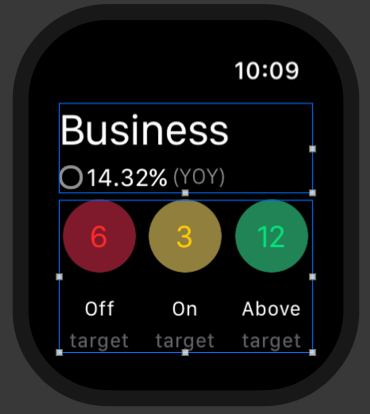
In our prototype, the main screen consists of two high-level groups in a vertical layout:
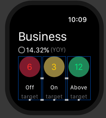
The three buttons at the bottom are arranged in a horizontal layout displaying the number of staff who are working either off, on or above their target KPIs. Each group’s height is set to 100% height with their width set to 0.32 and their horizontal alignment set to left, centre, and right.
Grouping related elements together through consistent use of negative space is vital to ensuring information can be easily scanned and understood. After all, most user interaction with the Apple Watch will be quick glances for just a few seconds at a time throughout the day, so easily scannable information is a must.
For the buttons in our prototype, we grouped our three items of key information into vertical alignment, allowing users to quickly and intuitively work out what each number relates to and facilitating a simple left to right scan to get an update on key business indicators.
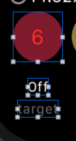
In the example below, the bottom two labels (‘off’ and ‘target’) are subviews of the group as a whole while the red circle is a group with a label inside it. To create the circular colored buttons it is a simple case of setting the background of the group to red and entering the radius to half of its width in the interface builder.
Interface navigation comes in two forms
Interface navigation in WatchOS takes the form of two styles: a hierarchical interface and a page-based interface. In our Watch app, tapping on a relevant sector takes the user to a view that is scrollable using the watch’s digital crown as part of a hierarchical interface.
On the other hand, page-based navigation is ideally suited for discreet or unrelated content that is able to sit on its own on a dedicated screen. It works just as its name would suggest with users swiping left and right between individual screens of content, a dot navigation bar on the bottom of the screen highlighting the user’s position.
A key takeaway here is that you cannot mix both navigation styles, you must select one navigation technique per app and stick with it. You can, however, utilise modal presentations for variation, which allow you to request information from the user or display new information across one or more screens in page-based format.
Elsewhere, you can ‘push’ and ‘pop’ just as you can in iOS by using WKInterfaceController, either by hooking up a segue in the storyboard, or by setting a controller identifier in the storyboard and then setting it to push or present with pushController(withName: String, context: Any?).
Drilling down into ‘On target’ departments using a hierarchical interface.
So there you have it, the key things we learnt from getting a perfectly functional Apple Watch app up and running in just a day. It’s really not that difficult to get a prototype working once you know your way around WatchKit. There are challenges, particularly for those who are used to working on the comparatively cavernous expanse of an iPhone screen, but Apple has purposely made the jump from iOS dev to watchOS dev as smooth as possible.


