The App Store is going dark, in a literal way. In iOS 13, Apple introduced Dark Mode, which allows users to switch the phone’s UI from white to black. The App Store’s UI changes in Dark Mode as well, so from the Today Tab, to category rankings, to search, no app is safe from the dark. With that in mind, it is important for app developers to consider how their app appears in Dark Mode to ensure the best conversion possible.
Why Optimizing for Dark Mode Matters
Research shows that 87% of smartphone users are using their phones each night within an hour of going to bed, when Dark Mode would be active. Additionally, users have the option to set Dark Mode as their default interface style. Since 50% of iPhone users have already updated to iOS 13, a growing number of users are browsing the App Store while in Dark Mode.
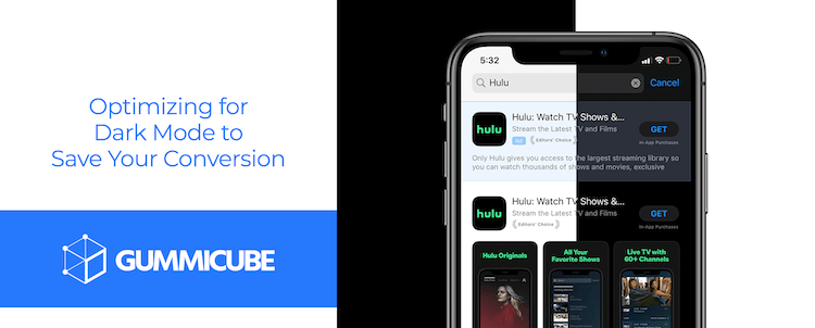
It is also important to know that 70% of app installs from the App Store come from searches. That means that how an app appears in the search results can have a big impact on its success. How creative sets stand out in Dark Mode when users are searching will be critical.
Optimizing for Dark Mode
There are a few things that you will want to consider when optimizing for Dark Mode. First and foremost are Apple’s guidelines. The company has specific guidelines and advice for developers when adapting their apps for Dark Mode. While this is specifically for in-app content, it can still be taken into consideration when designing creative sets for Product Pages.
Given how the black UI of Dark Mode provides a different kind of contrast with the creatives, you will want to consider the following design approaches:
- Test your design in both appearances and adjust to accommodate each one
- Soften the color of white backgrounds to prevent it from glowing and harshly contrasting with the surrounding dark screen
- Be mindful that black design with blend in with the App Store UI
- Vibrant text can help maintain a good contrast of the text on darker backgrounds
Overall, it is essential to test how any changes to your creatives perform in both Light Mode and Dark Mode. This may require adjusting designs or colors to find a good balance, as what works well in one mode may not perform as well on the other. Developers can run A/B testing to see if overall conversion changes, or even run focus groups to see how users will react.
General Best Practices
In general, app creatives should follow App Store Optimization (ASO) best practices. When designing the screenshots or icon, developers need to research the market and identify what trends drive conversions well. There may be certain color palettes, design elements, messaging and so forth that users respond to well.
Other best practices include:
- Highlighting a different aspect of the app with each screenshot, starting with the core features or values
- Including highly visible callout text relevant to each image
- Incorporating top-ranking keywords in the callout text, so users can see how their searches relate to the app
- Using each of the ten screenshots allowed
- Keep in mind that the first three screenshots are the most important for conversion from Search Results and the remaining images are important for Search Ads creative sets
Conclusion
Dark mode has launched on the App Store, and you do not want your app to get lost in the dark. Ensure that your app page listing is optimized for this new feature, since a large portion of iOS users already have access to it.
When updating your creatives, make sure you are following Apple’s guidelines as well as ASO best practices. This includes highly visible callout text and designs that follow the latest conversion trends.

You will also want to A/B test different creative elements to understand which ones convert best in both Light and Dark Mode. Once you find this balance, continue to test, as all trends eventually change.