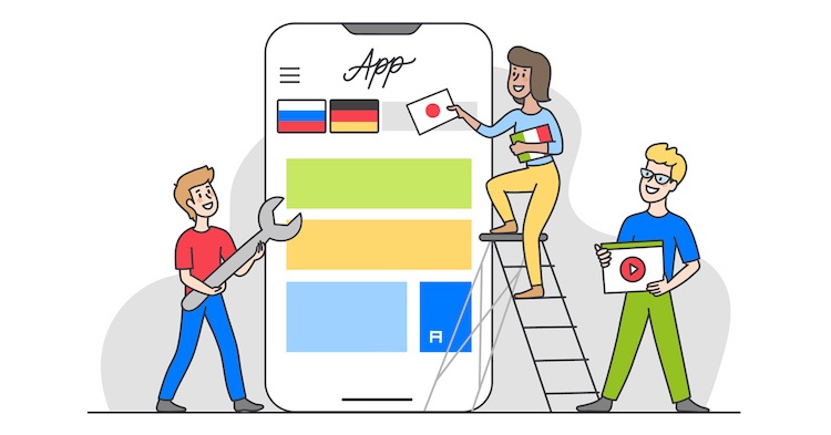
User experience is a critical factor that directly impacts the success of your app — whether users will love it or delete it immediately after installation. The issue becomes even more complex when we talk about localization, which means adapting a software product to the intended audience. It is important to note that localization is not limited to translation, but also adapts elements of layout and design to the given culture.
Hence, effective app localization services handle minute aspects of UX localization for all intended user groups. That each language has its own nuances goes without saying, but during the development process it is easy to forget these peculiarities and design the app’s UX with only one language in mind. As a result, the app ends up looking great — but for one target audience only.
To help you mitigate any possible risks, we’ve collected the top UX localization pitfalls that app developers may encounter. By being aware of them it will be easier for you to plan your overall UX strategy for future localization, instead of having to redesign everything after the product is launched.
Height and length
One of the most common UX problems during localization is word length in different languages. For example, the word “Hi” in English can be translated as “Salut” in French, which is more than twice as long. Different language characters can also be of different heights: while English, French, or German characters will be of approximately the same height, those of an Asian language like Chinese will be much taller. The result is that not enough space is allotted in the app’s layout: the localized text becomes unreadable, and the layout is ruined.
Left-to-right vs. right-to-left writing
Another thing to be considered is right-to-left vs. left-to-right writing. In the context of UX, the use of a right-to-left language (such as Arabic) also requires the reorganization of many UX elements. With right-to-left writing, action buttons and icons must logically be placed at left on the screen, so that they meet the user’s eye when they finish reading the text.
Consider the following example. With left-to-right writing, as in English, a user expects to see the “Next” button or the cart icon on the right, immediately following the text. That means the user sees the call-to-action button right after reading the copy. This issue must be considered if you plan to localize your app for Eastern countries where right-to-left languages are common.
Units of Measurement
Another issue that often happens during UX localization is the use of improper units of measurement, such as distance, weight, and even direction. For instance, weights in Europe are measured in kilograms, while in the US pounds are used. So, when localizing your app, make sure to consider these aspects and employ the proper units of measurement.
Lack of context
When you give a text to your translator (or translation agency), it’s absolutely essential to provide enough context for the translators to correctly interpret the text. Take the word “check” for example: does it refer to a bill, or does it mean “to investigate”? It’s impossible to know; translators cannot read minds. It is also a good idea to annotate placeholders with comments (we will discuss these in more detail below), and even to add screenshots for clarity.
String splitting
This issue relates to the previous one. In a user interface, a string is a line of text. So why would anyone need to split up a single line of text? The most common reason is the need to emphasize a single word, such as price, time, or location. An example might be “Starting at just $10.” If different styling is needed (or for any other relevant reason), a front-end developer would separate the string for easier implementation of the necessary styling.
But this kind of separation usually leads to a loss of context, since the translator often receives separate words like “from,” “to,” “check,” “now,” etc. Here the translator will have no clue as to the context, resulting in a poor translation, inconsistent styling, and an unsatisfactory UX. The best solution is to create one string only (using one style) for such phrases. Besides, you can use placeholders where necessary (for prices, times, locations, etc.) and style it independently from the rest of the string.
Partial localization
Partial localization is a mixture of languages, which can be encountered in a number of websites and apps. While sometimes partial localization is needed, such as for marketing purposes or for better comprehension of complex information, it also incurs a number of issues. First, the mix of languages may be confusing for many. Second, partial localization of visual elements related to a specific culture (colors, symbols, etc.) can come off as offensive and even rude, especially if you use them incorrectly. In short, you should risk attempting partial localization only for very limited purposes — for clarifying important information, collecting data, and the like.
Encoding issues
The character encoding issue is quite common; almost all of us have seen something like this on a website or in an app: . This is caused by character encoding mismatches. The first rule for any app developer who plans to make their product international is this: use UTF-8 encoding to cover all your potential translation and localization needs for different fonts, glyphs, and characters. Note that for Asian languages you will need to use UTF-16.
Hard-coded issues
One more mistake that many developers make when working on content is hardcoding the date, time, currency, and other units that are very likely to require localization. To avoid this additional headache, it’s best to keep such data in the form of localizable strings, so that your translators can always fix them if needed. It is recommended that you use a library to store different locales (keeping them in ISO format) and use this library any time you need to convert for a certain locale.
Summing it all up
The user experience is made up of hundreds of things, and even the tiniest mistake can ruin it. In order to create a truly user-friendly product, use advanced localization tools combined with a personalized approach to the localization process to achieve seamless performance. And remember: your visual elements should compliment your copy and vice versa, so check how they look together and see whether there are any inconsistencies between the intended message and the content displayed.
Should you need help with translation or localization, visit the Alconost website.


