When it comes to app store optimization (ASO), an icon’s importance cannot be overstated. People are visual learners, and love at first sight is very real for potential app users. Storemaven claims less than 30% of users ever go past the first impression frame of your app store page.
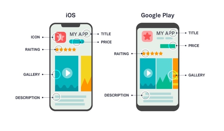
In the Apple App Store, the icon is prominently displayed in the following browse pages: today, games and apps page. And, it plays a role in search results and the actual product page. With so much depending upon the icon, it’s unsurprising the median potential conversion rate (CVR) is 18%.
In Google Play, the icon is a crucial feature of browse pages. Also, it’s the only creative marketing asset shown on the search results page. A strong one is therefore critical to your success. With this in mind, the median potential CVR on Google Play is 11%.
Here are the app store optimization essentials for both Apple and Google.
What is ASO?
First, let’s begin with the basics. According to App Institute, app store optimization is the process of optimizing a mobile app and mobile app store listing to maximize its visibility in the Apple App Store and Google Play Store. This allows an app developer to boost free traffic and improve conversion rate to generate the maximum volume of downloads and improve net profit. We believe the most effective focus of app store optimization is creative optimization.
Apple now allows optimization testing
Currently, about 70 percent of users actively use Apple App Store search with the express intent of purchasing new apps and games. To be effective, ASO requires testing to ensure your app is as visible as possible.
Until just recently, Apple didn’t allow App Store testing optimization, but this policy has now changed and you are able to run A/B testing on its platform. In the past, we typically used Google for A/B testing and would carry over winning concepts to Apple. Google Play also permits multivariate test components without a version update. You can do this through the Play console. Google Play is a substantially more advanced platform and more advertiser friendly than Apple.
Multivariate testing approach
We recommend a multivariate testing method for app store optimization. Here, we focus on the elements that drive the greatest financial returns: icon, feature graphic (or first graphic), and video. We found that these three elements are the most effective to increase the financial performance from your app’s listing. With Google as our sandbox, we test, discover winners and port them to iOS.
We utilize the following methods to deliver the best creative recommendations for the three categories.
Icons
The icon is the only visual element that still influences a user after install. Since it’s placed on a user’s home screen, it factors into engagement and app opens. Therefore, it’s imperative your icon is not only attention-grabbing, but also adaptive so it looks good on any device.

Fire Up Your Growth!
Moburst propelled leading brands like Google, Reddit, and Uber to the next level. Let’s ignite your Success journey today!
Claim Your FREE Growth Fuel!Also, you want to create a graphic that stands out among your competitors. As App Annie claims, there are approximately 2 million iOS App Store apps and 4 million Google Play Store apps. In a saturated market, it’s critical to be noticed. You can do this by using bright/primary colors, depending on your app’s target audience. These colors are attention-grabbing and have different subconscious associations with them. Therefore, consider your app’s users and what message you want your color scheme to convey to them.
Finally, don’t overstuff your icon. The temptation may be to put a character plus text plus an important game element into one icon. However, you need to realize icons are only 512 x 512 pixels. That’s not a lot of real estate to highlight your whole app’s universe.
Design with a purpose
Instead, design your icon with a purpose. Because apps serve multi-functional roles, they require specific design goals for each step of the funnel. Its immediate objective is to help create an emotional connection between your user and your app. Or, if your mobile game features an intellectual property (IP), the icon reinforces the definitive nature of the app. Finally, it can be used to define your value proposition. A mobile app that pays you to fill out surveys may want to highlight how users can profit through increased usage.
Now, there are some specific ways to achieve these three goals. Here are some creative best practices.
Highlight a prominent character/element
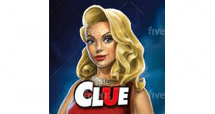
You should consider highlighting a prominent character or element from your app for the icon. In fact, this is a great way to establish an emotional connection between your user and your app. Clue: The Classic Mystery Game features Miss Scarlet, the classic red-piece character from the game. Since the first version of the Clue board game was created in 1943 in the UK and first published in the US in 1949, the iteration of the character will immediately connect potential users with the app.
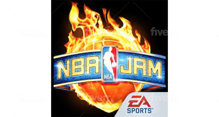
Also, you can do the same thing with an element or object from your mobile game app. NBA Jam is a popular sports game series that debuted in 1993. One of the most fantastical elements from the game was a player’s ability to be “on fire”. To get on fire, you’d have to score several baskets in a row without letting the opposing team score. Once the player was on fire, the player would be able to essentially score from anywhere until they were no longer hot.
The NBA Jam app’s icon is a picture of one of the most recognizable elements from the game﹘the basketball on fire. This immediately sparks nostalgia in a user that played this wildly popular game series.
Leverage your brand
Your icon should leverage your app’s brand. You can achieve this by using the same color palette for the graphic as you do for your brand standards and interface. Consider Pokėmon GO. Their icon image is of a poké ball. More importantly, the app reinforces the intellectual property﹘Pokémon﹘which makes potential users know this is a definitive app.
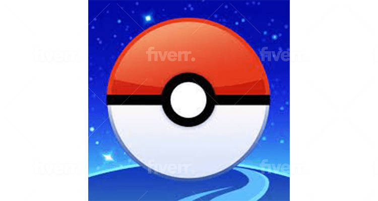
In fact, Pokėmon GO also follows other creative recommendations you should incorporate for app store optimization. They use the same color palette as their brand standards. The poké ball graphic is in the easily recognizable red-and-white design that’s associated with Pokémon.
And, the icon leverages the brand. Pokémon’s tagline, “Gotta catch them all!” is an essential element of the app’s gameplay. Users hunt for Pokémon in the real world while using the app. The icon highlights a key aspect of the gameplay﹘catching Pokémon﹘so potential users know what to expect from this app.
Define your value proposition
Finally, you can consider designing your icon so that it defines the value proposition. You can choose elements like the graphic that highlight your app’s purpose. For example, Cash App is an app designed for users to spend, save and invest their money. The icon is of a dollar sign, so users know the app’s associated with money. And, it uses a light-green color so users associate it with growth and optimism. All of these elements factor into attracting and gaining new app users.
How to test your icon
Again, the profound impact your icon has for app store optimization cannot be expressed enough. Your icon is involved in every phase of the funnel. Therefore, it’s critical to test it. As Storemaven claims, an optimized Icon has the potential to boost conversion rates (CVR) by up to 30%.
So, when you test your icon, you should keep in mind the following.
What/why are you testing?
First, you want to have a strong hypothesis for testing. A hypothesis such as what difference the colors you use isn’t necessarily a good basis for a test. Keep in mind, this is a factor in icon optimization, but there needs to be more of a reason behind why the colors are significant.
Instead, consider crafting a hypothesis based on what one of the three purposes you’re serving when designing your icon. If you have a kids game, you’ll want to design it with the target audience in mind. Your hypothesis can then be crafted like this, “I am testing to see how to best design my icon to attract our target demographic.”
Then, you not only have a reason why you’re making the changes, you can pinpoint specific differences. But, it’s not as simple as testing different combinations of characters/elements and colors. You need to even optimize image placement and shades of color. Storemaven used Google Experiments to test their client Gameloft’s distinct icon designs. Because each design was so distinct, they learned valuable insights﹘visitors didn’t respond well to a character in the icon. Potential users responded more to gameplay mechanism icons. They clearly know which elements are instrumental for the winning image.
Target meaningful metrics
Also, you need to target meaningful metrics to be able to declare the winner. For example, if you have a romance app, your target demographic may be 18-49. This is important because if you’re driving different users﹘say kids between the ages of 4-8﹘the metrics won’t be as impactful. This should make you reevaluate how you’re sending users to your app too. Attracting users in general shouldn’t be as important as getting users you’re trying to attract.
Some important KPIs to help you determine your winning icon graphic include app store engagement data and CVR-related data. For app store optimization, app store engagement data is one of the most critical measurements to understand your audience and the creative that’s driving their actions. Remember, your icon isn’t an isolated asset. It’s shown in conjunction with videos, screenshots, feature graphic (for Google), etc. If you reuse the same graphic over and over, this can repel potential users. Remember, variety is the spice of life.
For CVR data, you need to monitor:
- Overall CVR.
- Browse CVR, or conversion of users who discover your app through top charts, featured app pages, or navigation tabs.
- Search CVR, or conversion of users who discover your page by directly searching for your brand, or by searching relevant keywords and seeing your app in the Search Results Page.
- Referral CVR, or conversion of users who arrive from paid campaigns through sources such as Facebook, Google, or network traffic
- CTR Search and Organic.
- ITI (impression to install) of Paid Referral Traffic.
All of these KPIs are critical data to help you find your winning icon.
Feature Graphic
Feature graphic is the image that highlights Android apps on Google Play. These images are native to Google Play, and they’re the first thing potential users see when they open your app store’s listing. In fact, because it occupies 1/3rd of the screen on most Android smartphones and tablets, it has a significant impact on conversion rate. It could lead to a 31% lift in conversion rates, making it an essential aspect of app store optimization.
Creative best practices
While a lot of the creative best practices for icons apply to feature graphic﹘incorporate characters/elements, leverage your brand, etc﹘there are some unique aspects for feature graphic you need to consider. Let’s start with the general recommendations.
General recommendations
First, you should note how much space you’re working with when creating the graphic. The feature graphic size (a 1024 x 500 pixels) is bigger than the icon (512 x 512 pixels). This is a significant difference, as you have a bigger canvas to consider. This also reinforces the need to have adaptive designs.
Also, the file format for the feature graphic varies from icons. The feature graphic requires a JPEG or 24-bit PNG image. On the other hand, the icon’s specifications are for a 32-bit PNG image.
Now, here are the three design recommendations for feature graphics.
Create a clean graphic without too much text
According to Hotpot, Google Web limits each line of characters to 30-40. This is a good rule of thumb if you’re including text for your feature graphic. Remember, your feature graphic is like a billboard﹘users will only view it for a few seconds before moving on.
Look at WebToon. The name of the app perfectly describes the app’s purpose, and they use text to convey their message. The text isn’t crammed either, so users have a clear sense through a clean graphic of what they’re getting from the app.
Maintain brand standards/interface design elements
Again, this is similar to our creative recommendation for icons. It’s critical you maintain brand standards to leverage your brand for a consistent user experience. You can achieve this by using a color palette that highlights or compliments your brand. For example, Grand Theft Auto: San Andreas features a black and white color scheme throughout its feature graphic. The fonts and color palette leverage the larger Grand Theft Auto series’ brand standards.
Also, you should consider your target audience for your color scheme. The game app Hair Challenge is designed for people of all ages, but specifically targets women. The feature graphic boasts bright colors, and the character is reminiscent of a Disney princess. Within the game, the color scheme is exactly the same, so users are constantly being reinforced of the app’s aesthetics.
Include your logo
Finally, you can design your feature graphic to include your logo. This reinforces the marketing principle of seven touchpoints before a potential customer will internalize and act upon your CTA. In other words, the more times a potential user sees your logo, the more likely they will become your customer.
Monopoly abides by this rule. Their feature graphic not only has the traditional color scheme and font that make up the logo, they also have the iconic Monopoly Man. The game Monopoly was first published in 1935, so potential users also have a strong nostalgic connection and recognition of this iconic game.
Video
The final element we focus on for app store optimization is video. Videos are the not-so-secret weapon of 21st-century advertising. App Annie argues that videos impact conversion by 24%, while Storemaven claims videos can improve your CVR by up to 40%. The takeaway is, video can increase conversions at a significant rate.
For starters, video length is a vital element. Keep videos short, since MobileAction notes you only have 5 seconds to convince a user to watch the whole video. After that, you can expect about 10% of users will drop off every five seconds! Also, show your strongest messages first. The days of waiting until the end of a :30 spot to show your CTA are over. You need to frontload critical information.
However, while both the Apple App Store and Google Play allow videos, both apps display them slightly differently. App Store allows three video previews that autoplay on mute, and appear in the search results and product page. Remember, these videos can only be up to 30 seconds, so follow the old writing adage K.I.S.S. (keep it simple, silly). On the other hand, Google Play only permits one video via YouTube. The video is displayed on the top of the product page. And, make sure you don’t use a restricted video, or else potential users won’t be able to view it.
Here are some general recommendations for your videos.
General recommendations
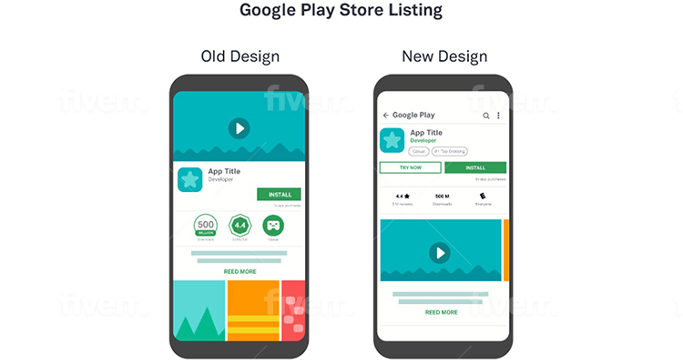
For Google Play, the new layout means the Gallery is now a critically important visual component. Before, the feature graphic was at the top of the page, and the Gallery was below the fold. Now, the Gallery is fully visible in the first impression frame. This layout change has increased explorer rate by 30-50%. Also, the Gallery Scroll rate has increased by 3-6 times the original one, so visitors are now 60% more likely to watch videos.
There are three types of Gallery options. Since the range of sizes of screenshots varies, so will how images and videos are displayed in the Gallery. Here are the options:
- Portrait﹘Between 2-4 full screenshots.
- Landscape﹘If you had a video and a feature graphic in the old layout, the video is now the first asset in this option. The asset takes up almost the full Gallery, with a small portion of the second asset visible to encourage scrolling.
- Hybrid﹘Video is displayed first, and portrait screenshots are resized to match the height of the video.
For Apple App Store videos, there are also several requirements. Mobile Action claims you must do on-screen gameplay capture within your app. You’re prohibited from doing over-the-shoulder angles or fingers tapping on the screen. (Be on the lookout for our upcoming blog that’s everything you need to know about gameplay capture!) Also, you need to make sure you have the correct resolutions for different devices. This means making sure the specs for portrait or landscape are both accurate. And, you need to disclose if anything featured in the video is an in-app purchase.
Remember, your video isn’t an ad. Don’t be tempted to include how much the app costs. Focus instead on what will sell your app.
Here is the major creative recommendation for your video.
Highlight features
For your video, you want to make sure you highlight the most important features that attract users to your app. For Farming Simulator 20, their Google Play video demonstrates how you can drive more than 100 different authentic vehicles and tools. The footage focuses on some of the different types of tractors, plows and other vehicles you can use.
Also, you want to use captivating sounds and visuals to showcase gameplay. Star Wars™: KOTOR II uses gameplay features with everything you’ve come to know about the franchise. The sound effects in the video are of blasters, lightsabers, and an operatic score. There is also epic dialogue to give potential users a sense of the plot. And, all of the lightsaber duels, shootouts, and spaceship dogfights are shown throughout the video.
Finally, you should use actual app footage. This gives users a true sense of what they’re getting. Pocket Build showcases footage of all the different worlds you can build, from rustic farms, coliseums, fortresses, to exotic temples.
Consider other recommendations
While we give recommendations for icons, feature graphic, and videos, you should incorporate all these ideas into your app store optimization when appropriate. This means leveraging your IP to reinforce you’re the definitive app for a brand. Or, don’t shy away from including your main characters in any asset. As we mentioned earlier, make sure you don’t use the same graphic or image in everything because it will become stale. Instead, feature your main character in unique ways to still leverage your brand while showcasing other aspects of your game.