Quality Assurance in software development is initiated to ensure the code has no bugs. We can rightfully apply QA to design. The design evaluation process involves usability testing and expert evaluation. Below we’ll focus on the two sides of the story and provide specific examples of the QA design process based on our experience as a digital development agency.
High-quality design must satisfy a wide range of criteria
These include:
- How easy is it to navigate a website or mobile software?
- Are the page/mobile app structure and options intuitive? Does the user have to scroll down the page or search the website for the required information? If quantitative or qualitative data suggest the features are not used as intended or are being dropped off, the design needs critical changes.
- How accessible is the information? Does it take a lot of effort to read a text and make sense of the information?
- Correspondence to the style guide: The design should match the mockup provided initially in the stage of prototyping.
- Does the design help to increase user engagement? It’s about a more appealing and interactive design and the logic of user-app interaction.
Usability testing identifies the problems hindering the achievement of business objectives or user engagement goals. Also, customer engagement and analytical data are examined to verify user experience.
The methodology and tools of the QA design process
Functional and non-functional testing
Functional tests aim to determine the loading speed and technical indicators of the mobile app’s performance. During the functional testing, working with the product manager is advised to ensure the app is ready to release. Non-functional testing evaluates the design properties from a user’s viewpoint and assesses the design consistency according to the initial intent and best practices. For example, assessing colors and font sizes and checking content order are examples of classic non-functional QA testing in the design stage.
Manual and automated testing
Most design examinations belong to manual reviews. Using the correct style guide elements, you should check if the implementation matches the mockup/design specifications. Automated methods help with responsive testing by using specialized tools, checking all screens and device versions, and catching all visual bugs. The last method works for stable UIs.
A/B split test and multivariate testing
Two versions of the product are compared against each other to find out which works better. The audience is split so that group A could evaluate version A and group B will check version B. An A/B test is also called split testing.
With multivariate testing, you explore the reaction of users to multiple factor variations, which takes longer but provides informative results. A/B and multivariate testing allow for tracking different design versions’ performance against set goals.
Focus groups, surveys, and impression analysis
You must be prepared to ask your focus groups very specific questions based on the hypothesis. It prompts participants to guide their thoughts toward a certain scenario and make practicable suggestions for change. Leading focus groups is especially useful when determining what the user wants from the system. It’s recommended to include at least six users in the focus group.
Customer effort score surveys show how much effort one needs to interact with the tested product. It usually suggests answering a question like: “How easy was it to interact with the website/app?” Other types of surveys may include open-ended questions in the form of an automatic feedback form.

Impression analysis aims to obtain information about the first impressions of the mobile app’s design. It can be a 5-second test, after which participants will be asked to list their impressions.
Heat maps
Visually represent users’ behavior, number of clicks, scrolls, mouse tracking, and other aspects. Various online applications help QA testers generate a heat map and see where the design is broken.
Measuring performance against goals
Any Quality Assurance test should check against the goal set by the project. Special metrics facilitate developers in this task. The goals can specify the number of ad views, inquiries, leads, sale deals, the level of customer satisfaction, etc.
Metrics analysis is essential when product owners realize there’s a problem but cannot identify its major source or sources. Testers and/or designers examine user behavior with the help of various tools and analytical programs (e.g. Google Analytics, Hotjar, Dovetail, Google Forms, Bugwolf, Web Visor), understanding at which stage the issue occurs. Another approach is to verify product performance and follow a UI/UX checklist. Those checklists are written based on best practices of UI/UX evaluation.
New technologies made it easier to measure user experience and check how people interact with your products and how much this interaction satisfies them:
- Engagement levels: The time spent on pages, the number of shares on social media, clicks, and pages/screen views.
- User retention shows how many users are returning to your website or app.
- User metrics: If you offer an app, this could be the number of installations. For websites, this is the number of visitor sessions, session duration, etc.
- Usability check shows how easy it is for users to interact with the functions of your app or the features of your website. The aforementioned customer effort score survey is exactly such a metric.
- User adoption indicates if and how users adopt your product. For example, you can match the number of app installations against the number of app opens.
QA design testing checklist: A case study
Let’s now have a look at how we conducted a Quality Assurance test for one of our commercial partners’ website.
QA testing: A case study
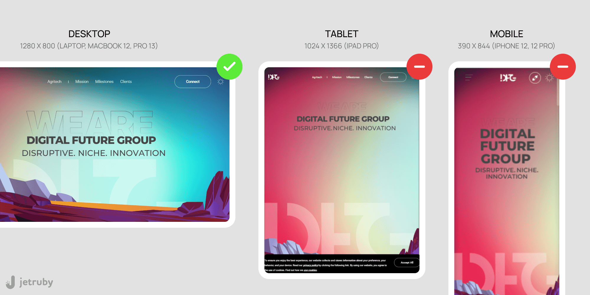
Source: JetRuby
Adaptive design
- The text isn’t easy to read on mobile. The text overlaps with the background icon image on one of the mobile devices.
Website header
- The header elements overlap on some of the adaptive mobile versions.
Functional testing
- The mobile version of the website takes longer to load than the desktop version.
Navigation
- The navigation is confusing on both desktop and mobile. Upon clicking on a specific menu title, you’ll be redirected to another affiliated website, which the user does not expect.
- It’s not self-evident that some titles are clickable, and the page contains more information under these titles.
Animation
- The switching between screens on mobile devices could be faster and smoother.
User interface
- When the user hovers the mouse over a particular field, there is no response (i.e. it doesn’t become active).
- The style of the round button and rectangular field shapes is different.
- The description must be more specific. Most importantly, there is no option to click the client icon to read more about the project.
Accessibility
- The text lacks contrast, which makes it difficult to read. Signatures cannot be seen.
- The lack of H1, H2, and H3 headings makes them less accessible.
The research was done with the help of the five seconds test and by interviewing users.
Bottom line
Ensuring a successful design Quality Assurance is inseparable from providing a seamless user experience and easy interface navigation. While you can refer to the checklist and best practices of quality assurance in design, continuous UI and UX optimization are the priority. Both processes involve acting on collected feedback from users, understanding critical touch points on mobile apps, and elaborating a flawless onboarding experience.