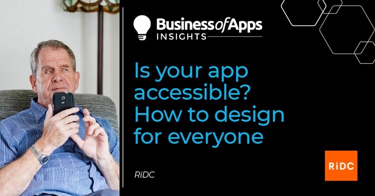
There are over 14 million disabled people in the UK – a number that’s due to rise with our aging population. During the last year, as the UK has struggled through lockdowns and isolation, many have turned to apps for essential daily needs – finding out essential news and information, health services, socialising, even entertainment.
But unfortunately there are still people who still unable to engage with apps, meaning they now face an increased digital isolation. A recent survey by RiDC (Research Institute for Disabled Consumers) found that although most (90%) of disabled people have downloaded an app, over a quarter have had difficulty accessing or using one. With almost half of these people (44%) then going on to uninstall or delete it.
The most common accessibility issues related to downloading and setting up, not supporting assistive technology, crowded displays, filling in forms and registering and poor text size or font.
‘I would like it if (when filling in forms) I could speak my email address into it and other details. (Filling it in manually) is tricky because sometimes my hands get spasms and I end up pressing letters or words I don’t want to.’
‘Too many colours make it confusing for me… and when the contrast between the background and the writing isn’t very clear.’
— Dr Wesley Scott, a participant in the survey who has cerebral palsy and learning disabilities including dyslexia.
With the spending power of disabled people estimated at £249 million a year to UK business, there is a large amount of custom for app developers to be missing out on.
Thankfully, it is a problem easily solved.
If you think about designing for all people from the beginning of the design process then you won’t miss anyone out. Or, if you already have an app developed, get it reviewed and user-tested by a wide range of people who can offer their insights on possible problem areas and solutions. Many of the changes might be simpler to make or include than you think, and others may highlight options you had never thought of.
RiDC has a long history of consulting the members of their panel on technology and app use, and has facilitated a number of recent usability testing workshops on apps. Here are our top ten areas to consider when designing and improving apps.
Download and set-up
- Consider if the app is easy to find and download from the app store
- Are clear instructions provided throughout the whole set-up process?
- Could the set-up involve less steps? The simpler, the better.
Support for assistive technology
Many users have assistive technology already installed on their own device, and the app should be able to link into this, so the user can access the features they need while using it.

Fire Up Your Growth!
Moburst propelled leading brands like Google, Reddit, and Uber to the next level. Let’s ignite your Success journey today!
Claim Your FREE Growth Fuel!- Some of the most commonly used are screen-readers such as Voiceover and Talkback, zoom and magnification features and other enhancements such as enlarged text size, contrast, colour inversion. Can the app support these?
Ability to customize
- Users with visual impairments or colour blindness should be able to adjust the text size or change the colour contrast in the app’s settings
- Are users also able to customise the app’s layout and chose what information is displayed to them?
Consistent layout
Too much information on a page or too many different ways of saying things may make it harder for someone to understand what they need to do or know.
- Buttons and icons that are repeated across different pages should be presented in a consistent layout
- Look to make the arrangement of on-screen components the same across different screen sizes and orientations (portrait and landscape)
Simplicity
It is easy to focus on the style and look of the app but this could be stopping the app from being used by a cohort of people. Make functionality the priority to ensure you’re not blocking any potential users.
- Use a minimal deign for the apps’ interface and avoid unnecessary elements (e.g. multiple graphics) that could interfere with its functionality
- Don’t crowd the interface with too many graphics or information
- Ensure important on-screen components are clearly visible without the need to scroll
Clearly displayed buttons and information
- Use good colour contrasting between text or icons and the background (i.e. no less than 4:5:1) Does this contrast support users in different lighting conditions (e.g. glare from the sun)?
- Buttons, icons and images should be clearly presented and labelled with text
- Buttons need to be large, with spacing between them (at least 9mm tall by 9mm wide) for users to target them by touch
- Buttons placed where they can be easily reached when holding the device in different orientations (i.e. portrait or landscape)
Simple touchscreen gestures
Many people live with a health condition, or simply old age which can affect their ability to hold things still or make very targeted gestures with their fingers.
- Simple tap or swiping gestures are easier than sustained holding for people with dexterity impairments or hand tremors
- Ensure users are able to easily return and fix their mistakes if they have carried out unintentional gestures
- Give users the choice of using alternative gestures to support their dexterity needs
Easy to input information
- Provide the user with a choice of data entry styles (e.g. select menus, radio buttons, check boxes or autofill), instead of text boxes only. This gives more manageable options for users such as those with visual, dexterity and learning impairments as inputting text could be challenging.
- Include the ability to enter numbers and text in alternative ways (e.g. speech input, Bluetooth keyboard, face ID)
Feedback for the user
- The app should inform the user that the action they have performed has taken effect. For example, when they tap or swipe on something does it could them know what has changed – either visually or through audio tones or haptic feedback
- Does the app provide enough indication to help the user recognise, diagnose and recover from errors?
Ease of understanding
- Make buttons, icons and images to be easily recognised and understood without users needing to rely on memory
- Is it clear which features of the app allow users to perform certain actions?
- Are all users able to easily understand the information presented?
At RiDC, we want services and products such as apps to be made accessible to disabled people at a time when we really need them. To find out more about we could help you to do that, go to https://www.ridc.org.uk/content/research-and-consultancy