
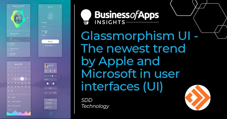
Glassmorphism UI is the newest trend that emerged in the user interface of the most famous and popular brands such as Apple, Microsoft, and Dripple. Transparency and blurred background are the most attractive features of this new interface which is eye-catching in combination with colorful images and shapes.
Stay with us in this article to show you how this amazing style can make a huge revolution on the appearance of your website.
What is the Glassmorphism UI?
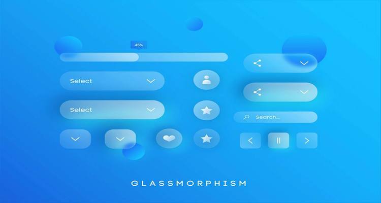
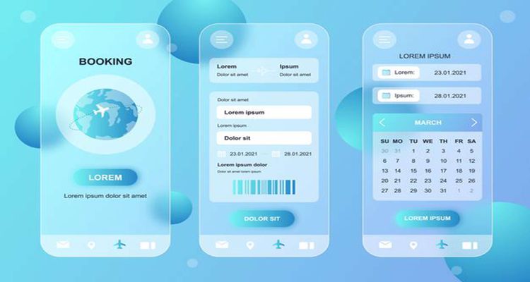
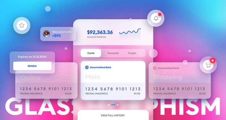
Glassmorphism UI is a card-based interface used for designing the user interface of websites, smartphones, web app, mobile apps, etc. based on three important effects: transparency (frosted-glass), vivid or pastel colors, and a light border. Combining these three effects results in a glassy style called Glassmorphism UI.
The purpose of designing a user interface with this design is to make a balance between three elements:
- Background blur
- Shadow
- Transparency
The advantages of the Glassmorphism style:
- Offering a beautiful and minimalistic look
- Providing A dynamic design language
- Improving UX by keeping the users engaged and inspired
If you need more information about improving User Experience (UX), read our recent post that talks about “10 Best UX Design Practices For Ecommerce”.
The disadvantages of Glassmorphism design:
- Create Readability problems especially for visually impaired and color-blind users
- Make all icons look like an action button
How has Glassmorphism become so Popular?
UI & UX designers tried to pay attention to the Glassmorphism UI as a modern style and a new trend when Apple brought this innovative design to life in iOS 7.
Soon after, Microsoft tried using this new interface on the app surfaces of Windows Vista under the name of “The Acrylic”.
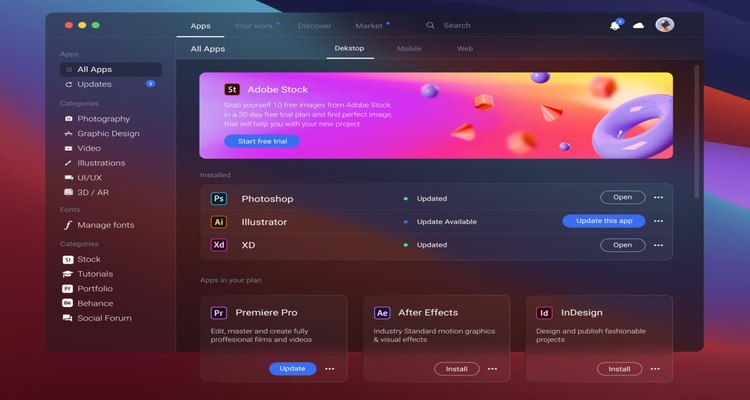
But it was not until Nov. 2020 that Glassmorphism UI became so popular when Apple used this effect again on the latest update of macOS Big Sur.
Since then, Glassmorphism UI has been developed by a lot of new fonts, colors, and shapes designed by creative Web and mobile app developers to make it more popular.
What are the main elements and features of Glassmorphism UI?
The idea behind Glassmorphism design is to create an interface that looks like a series of glassy panels floating in the background space. To make this innovative and astonishing style happens, the following main features are required:

Creating Transparency by background blur
Transparency and blur background are the main features for displaying a glassy effect. Since it is a card-based interface, more light must be attracted by the “card” or layer on top to increase the transparency while the deeper layer has lesser transparency. Adding a subtle shadow around the contours of the cards gives the impression of extra depth in this design.
Multi-layered style
The only way to build a Glassmorphism in a user interface design is to create a multi-layer style in which some colorful and transparent layers are well-adjusted on a blurred background. Using the blurred objects on a blurred background or the deeper layer induces a 3d space in the perspective layout.
Colorful but subtle background
Choosing vivid colors for the background is essential for designing a Glassmorphism UI. Using colorful but subtle colors can highlight the blurred transparency which plays a crucial role in making the glassy style visible on this new design.
There are some innovative trends that you can add to the background to make it more attractive for your visitors or match it with other elements that already exist on your website including:
Gradients
It’s a good idea to add a gradient with a similar color scheme to the background of your Glassmorphism style. In this way, you can create a harmony between different elements that exist in the overall look of your interface.
Geometric elements
Using Geometric Elements is another trend to be combined with the blurred background to make an enjoyable and astonishing look. It sounds great if you also add them to your frosted glass design. The final result will surprise you! To better match the Geometric elements with your background, try to use simple shades and edit border-radius or colors.
3D designs
A huge approach is toward using 3D designs among UI/UX developers exactly like Glassmorphism, these days. Why don’t you take the most advantage of both? It’s a great opportunity to make a 3D element outstanding by using a glassmorphism overlay. There is no special rule for adding different 3D elements in front of and behind the overlay, so let your creativity speak and enjoy building an eye-catching design by the combination of the two popular trends of 2021.
Light borders on the transparent images
Most of the astonishing Glassmorphism UI designs use semi-transparent white borders on the transparent objects floating on the blurred background to make them stand out from the background.
How do you use Glassmorphism design for a user interface?
If you want to impress your visitors by displaying a Glassmorphism UI, you need to utilize it very precisely according to some basic rules and principles to make it shine on their eyes.
As the first rule, don’t forget that Glassmorphism design has the best effect on simple shapes floating on blurred backgrounds with contrast colors. The color and transparency can be picked from light or dark mode as an effective tool for web or app development.
As the second rule, we recommend you choose the right colors and then try to use them very carefully for designing your interface. The transparency grade is of great importance as well. Reviewing the best Glassmorphism UI practices can help you to have a farewell judgment about the suitable color and transparency grade.
The third rule is about where and how you want to use Glassmorphism UI. This shiny style greatly influences attracting customers or visitors to your website or mobile app when applying just one or two elements. Overusing Glassmorphism design may hurt the User Experience of your platform.
And finally, to improve the User experience after applying this brand-new CSS UI on your website or app, consider making a clear hierarchy by creating enough contrast and right spacing to organize the related objects on this multi-layered design.
Having these simple rules in your mind is enough to start creating an eye-catching UI for your site or app.
6 simple steps to create a Glassmorphism design on your website
By considering the above-mentioned rules, you are ready to incorporate Glassmorphism on your user interface by tweaking the HTML/CSS code as follows:
- Find the best vantage point on your website or app
- Choose a light and colorful gradient for the background
- Consider a controversial design for the icons
- Set the right transparency grade by using a common UI design tool like Figma
- Add some fine borders to your design to give it dimensions
- Add a shadow underneath to make it glass-like
To make this design work for all of your visitors, here are some useful tips:
- Don’t apply the blurring and transparent effect altogether in areas that require active interactions.
- Don’t use this design aesthetics in buttons, toggles, navigation menu, and similar elements.
- Use transparency and blurring effects not just for decoration purposes, but for boosting the overall look and feel.
- Apply proper contrast with the cards in the interfaces to ensure the ease of accessibility
- Create the right spacing between the cards and grouping together all the objects related to one another
- Dodge accessibility issues of Glassmorphism by choosing the right contrast and intuitive grouping of cards in the design layout
If you want this visual style applied on your website while you don’t have enough knowledge for tweaking your website code, it’s time to get help from a professional UI / UX developer.


