False consensus bias.
The tendency to believe that one’s own beliefs—are more widely shared than is the case.
What does that look like within marketing? We assume our target audience automatically shares the same interest in our products as ourselves. This can be true of developers and their apps. Yet 70 thousand new apps on the Google Play Store and 32 thousand on the App Store are released monthly.
False consensus isn’t a bias app developers can afford. We need to remind ourselves that no one pays attention—not until we make them.
That’s the heart of Conversion Rate Optimization. Presenting your app within both marketplaces in the best light possible, design-wise, and language-wise, gearing everything towards making a great first impression, (literally and metaphorically). Because within these marketplaces… The book is indeed judged by its cover.
Within this article we’re going to talk about how you can craft a great Conversion Rate Optimization strategy for your app storefronts: from the research required for building out all the elements and assets of your app store listing—to continually measuring the effectiveness of each hypothesis.
What is App Store Conversation Rate Optimization?
The number of people who have visited your app store listing that you’ve convinced to download your app. This metric is calculated by dividing the number of conversions by the total number of visitors and multiplying the results by 100, which results in your conversion rate percentage.
Conversion Rate Optimization (CRO) is the practice of optimizing your app listing to maximize that percentage. This is content design, data, and strategy all striving towards creating an app store listing that’ll have the captivated thumbs of your target audience gleefully tapping download.
Building the foundations of a great app store CRO strategy
Before getting elbows deep in design and copy—thorough research and analysis are required for the best chance at presenting your app in a clear, enticing manner. This involves a few tasks that include but are not limited to:
- An audience analysis
- A competitor analysis
- Crafting a strong value proposition
Set the stage with an audience analysis
Every CRO strategy should begin with empathy.
Our actions are based on emotion—we feel, we decide—we subconsciously gauge the merit of a product in lightning speed. Marketers can take advantage of this by finding ways to understand and empathise with users so that we can speak directly to their needs.

First, comes finding your target audience. You can do this by analysing current data, or if it’s a brand-new app—finding insights via social media channels, Reddit, or anywhere that might help you gain some vision of that audience, then you can start empathizing with them.
You can begin to do that by asking the right questions:
- What needs or problems are the users aiming to solve with this app?
- What are the primary reasons users download similar apps?
- Why might someone engage with this app store listing in particular?
Answer these questions and you’ll have the beginnings of an audience analysis.
Go right when your competitors go left
The banking and fintech space was once a sea of navy. The industry collectively imagined that this embodied trustworthiness, that anything concerning your money should be almost regal. But in 2015, a bank card began appearing in the hands of uni students and London creatives—a neon coral bank card—the rest is history.
Contrary to popular opinion originality isn’t myth or magic. It’s very simply taking the established pattern and adding the next intuitive layer. Learning from your competitors’ mistakes and identifying areas for improvement, or brainstorming ways to put a new lick of paint over a tired status quo can be an extremely lucrative exercise. Especially within the app store, as it’s an inherently visual, brand-driven space. Again, actions (downloads) stem from triggering the right emotion.
Craft a compelling value proposition
Tell your story.
Apps that effectively utilize storytelling techniques within their descriptions and screenshots experience higher download rates, in fact, 30% more downloads compared to generic descriptions. What exactly is a brand story? It’s what makes your app unique, what solutions it brings to users, your USPs and more. There’s always a story to be uncovered.
Crafting the right elements for your App Store listing
Create an App Store icon that stands out.
App store icons play a crucial role in catching the attention of potential users and creating a memorable visual identity for your app. The icon is the first thing users see when they come across your app in the store—and it can significantly impact their decision to click and learn more—again, we feel, we decide.
When designing your app store icon, it’s of vital importance that the icon is unique. It should stand out from competitors and convey the essence of your app’s purpose. Complex designs generally aren’t advised, the icon will be displayed in multiple sizes, so it should be recognizable in smaller dimensions.
Write a descriptive subtitle
Think of this as your elevator pitch. A potential user must understand exactly what your app does within a few short words. Your subtitle should be a brief, captivating statement that complements the app’s title with additional information. It plays a crucial role in attracting potential users, optimizing conversion rates, and driving app downloads.
Busuu app store listing with descriptive text
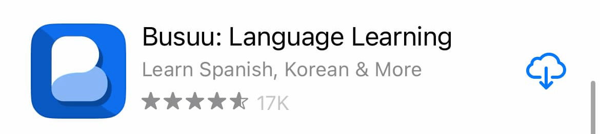
Source: ConsultMyApp
Here’s an example from one of our clients. The subtitle expands on ‘Busuu: Language Learning’ by referencing some of the languages a user may be itching to learn.
Craft your App Store long description
The long description serves as an extension of the app’s subtitle and provides a more comprehensive overview of the app’s functionality, value proposition, and unique selling points. This will afford you more space to tell your app’s story, showcase its capabilities, and create that great first impression.
The first sentence is the most important, why? Because users can read it without tapping ‘read more’ which they’ll only do if the initial copy grabs their attention. You want to make sure this is clear and focused on your best selling points. Take the most user-centric approach possible—speak to the customers’ needs and present your app as the answer to those needs.
Tell your story with App Store screenshots
App store screenshots are arguably one of the most important elements that you’ll be presenting within the app store. These are visual representations of your app, showcasing the user interface, features, and functionality. They need to convey your app’s USPs, brand, and everything we’ve mentioned thus far, fast—within-6.8 seconds fast. That’s the average time a potential user spends on any app store listing.
Chegg
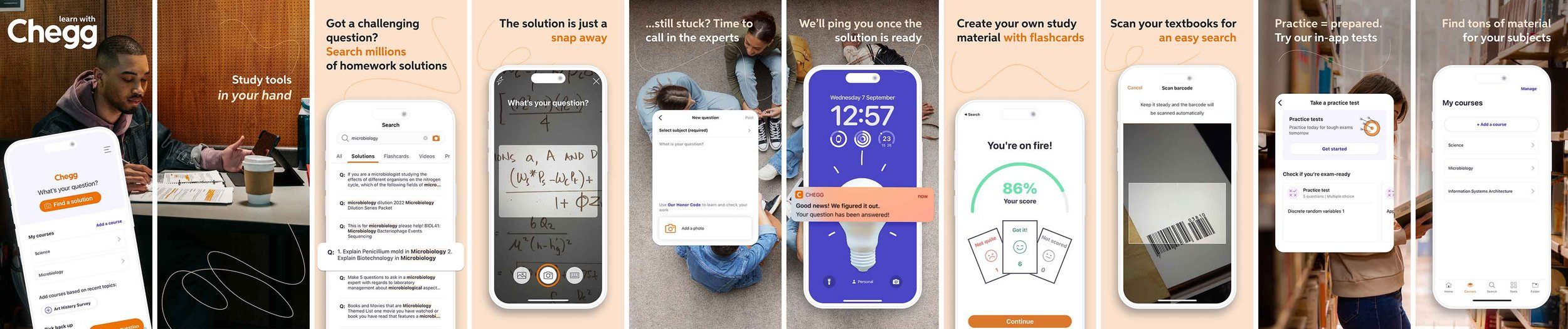
Click on image for full size
Source: ConsultMyApp
Above is a full set of screenshots produced for our client, Chegg, an app which aids students with homework and exam preparation. We spoke directly to Chegg’s target audience by addressing their needs within the narrative—all presented in an aesthetically pleasing format.
It’s important to tell a cohesive story throughout the screenshots. And the first screenshot should really make an impact. Always use high-quality backgrounds or relevant images that evoke emotion, and help users understand exactly what you’re selling in a heartbeat.
If social proof is available it’s a great idea to feature it within your screenshots. That could be user reviews, ratings, affiliations with trusted brands, media mentions, or when your app picks up momentum—boasting of a strong existing user base, eg, “A million happy customers”.
Just by updating Chegg’s screenshots to the above, we were able to greatly improve their conversion rate.
Design your app preview video
An app preview video allows you to showcase your app’s features and user experience dynamically. You can provide a walkthrough of your app, demonstrating its functionality and benefits in motion. App preview videos are incredibly useful for engaging users and giving them a glimpse into the app’s features, UX and more.
This really helps users envision themselves using your app, and consequently, an enticing App Store Preview can significantly increase conversion rates.
App Preview Videos are important for both stores; however, Google Play Store users are 40% more likely to show decisive behaviour—which means App Preview Videos (being the first thing they’ll see) are generally more important on the Google Play Store than on Apple’s App Store.
Another thing to note is because each marketplace has varying rules and guidelines for their videos, the finished product is generally quite different between Apple and Google’s preview videos.
With Apple, the rules for upload are strict. Essentially, the entire video needs to take place within the device frame and provide an accurate representation of using said app. No marketing messaging or external branding is allowed.
Google give you some wiggle room. They allow you to unleash your creativity and effectively convey your brand story, unique selling points (USPs), and more. This freedom empowers you to create compelling videos that captivate your audience.
Unlock opportunities through Localization
Localization can often be mistaken as simply translation, but in reality, it goes much deeper than that. It should be a holistic approach that adapts the language, visuals, and cultural nuances of product pages to deeply resonate with local users. By embracing localization, brands can create a truly personalized experience to establish a strong connection with their target audience.
Localization allows for experimentation. Let’s say a food delivery app is expanding its services to a new country, where the diet drastically differs. The App Store Screenshot design could feature popular local dishes and regional specialties to test if familiar foods trigger a higher conversion rate.
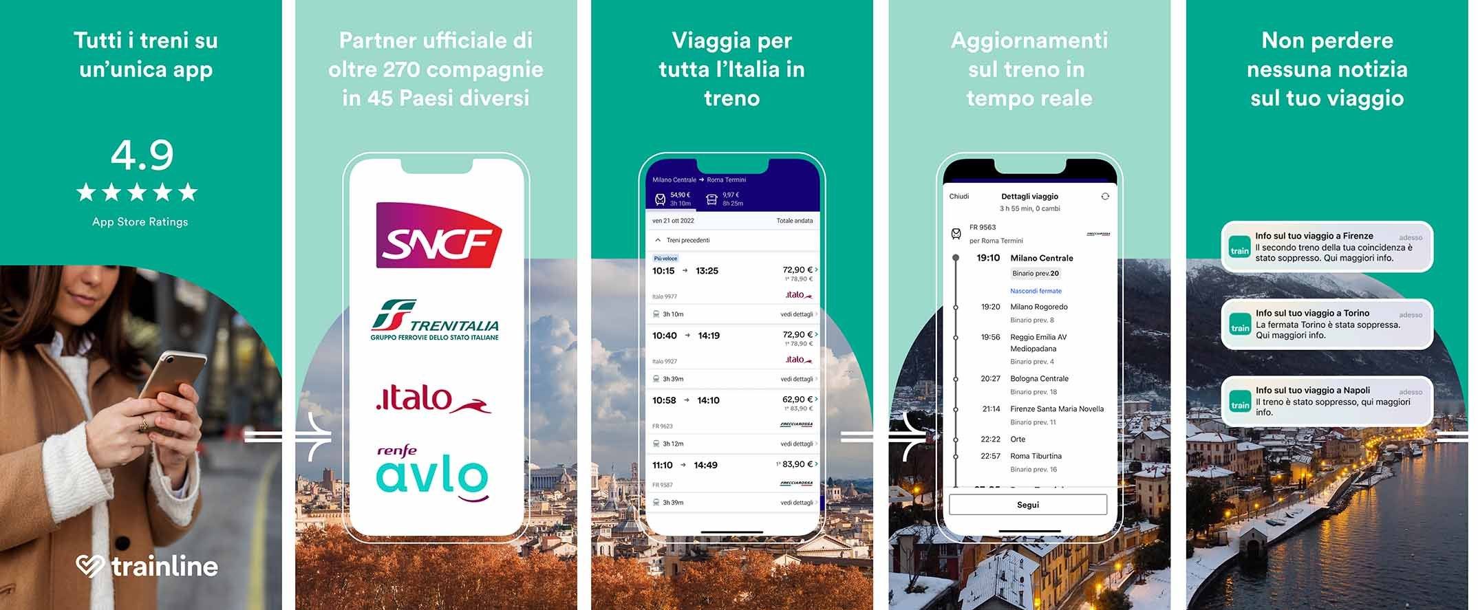
UK localization
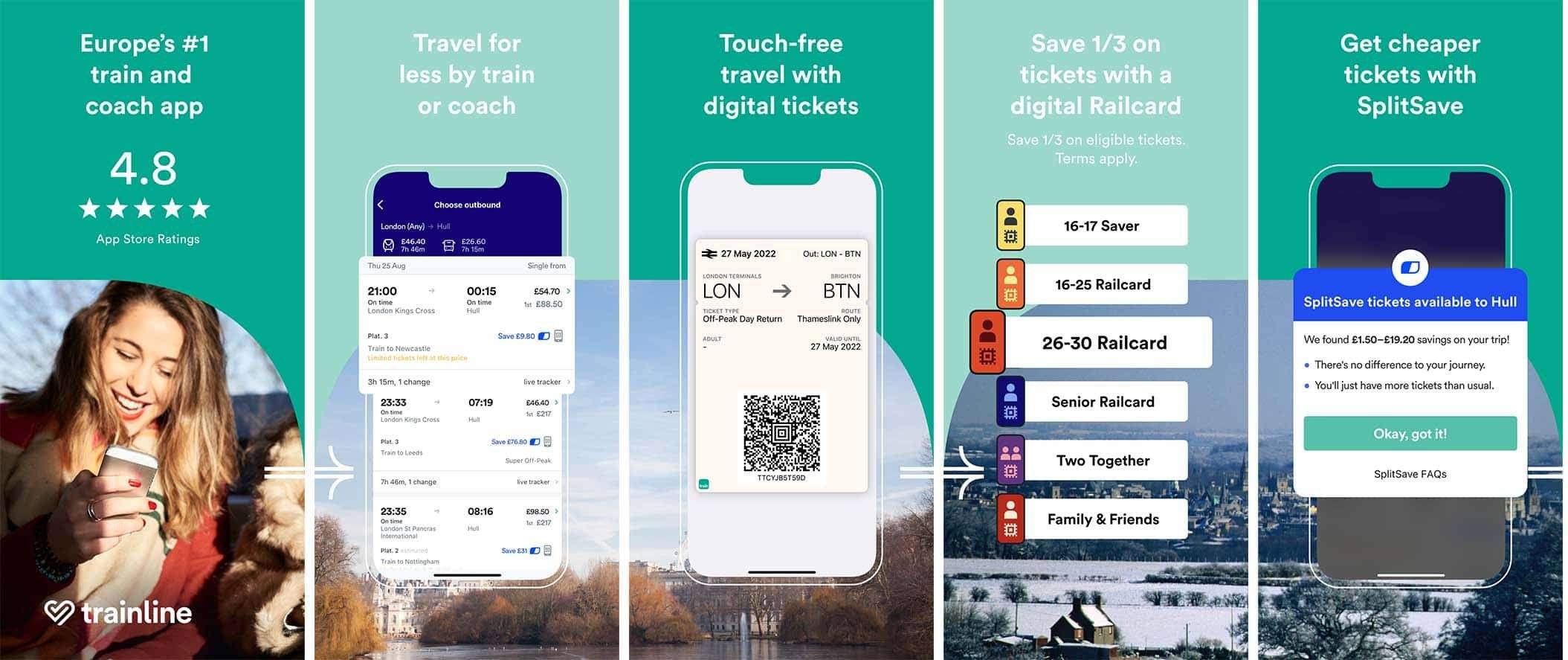
Click on image for full size
Source: ConsultMyApp
The three sets of screenshots sets below were designed for our client, Trainline. Every element previously mentioned was localized, from the descriptive subtitle, right to the App Store long description.
These sets were tailored to suit the localization preferences of different countries. Each listing underwent language localization to provide an optimal user experience. Moreover, we adjusted the high-quality imagery used in the screenshots to reflect the culture and landmarks of each country.
French localization
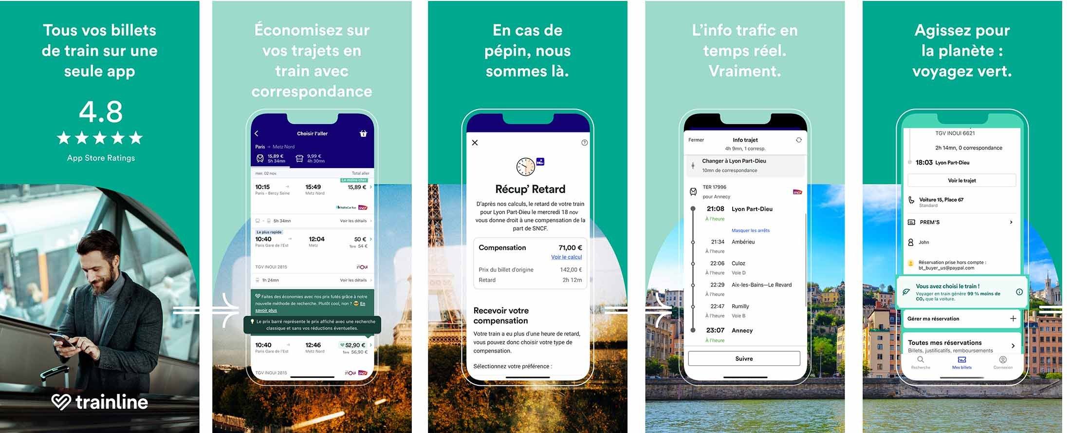
Click on image for full size
Source: ConsultMyApp
For instance, the French version prominently featured the Eiffel Tower. In addition to localization, we incorporated seasonal imagery to add relatability. By showcasing an autumn landscape, users could envision themselves traveling during that time of the year.
Italian localization
Click on image for full size
Source: ConsultMyApp
Ratings and Reviews
The significance of reviews and ratings shouldn’t be underestimated. Ensuring that your app’s reviews and ratings are in excellent standing is of paramount importance.
Positive reviews and high ratings serve as social proof, instilling trust in potential users. They can sway the decision-making process, influencing users to download your app over competitors. The flip side of that is that negative reviews or low ratings can immediately raise concerns about an app’s quality.
It’s essential to actively manage and respond to reviews, addressing users’ concerns and providing helpful insights—encouraging satisfied users to leave beaming reviews can also contribute to a healthy rating profile.
Rating and Reviews
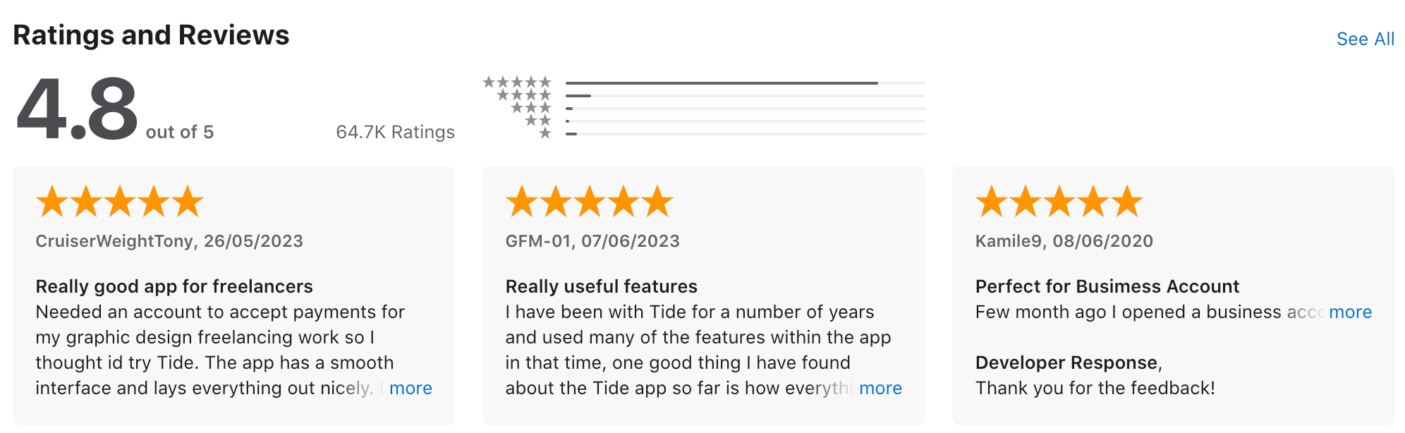
Click on image for full size
Source: ConsultMyApp
Understanding when a user is likely to leave a good review, and prompting them at the right time (according to your product analytics data) is a great method of driving positive reviews.
Below is a great example of (ideally) what your App Store ratings and reviews should look like. The highlighted reviews are all 5 stars, and the developer (one of our clients, Tide) is diligently responding to every review, good or bad. This creates a caring brand perception for any potential users reading.
Use a hypothesis planner to test your CRO capabilities and improve your App Store Conversion Rate
The app store screenshots, video, or icon are just pieces of the puzzle in your CRO strategy. So, how do we test those assets? And continuously refine each element to ultimately drive a higher conversion rate within your app store? A hypothesis planner.
This helps you plan, test, and iterate your CRO strategies—allowing you to make data-driven decisions and ultimately—achieve better results.
Define your objectives and key metrics
Whether it’s your click-through rate (CTR) on your app store screenshots or the conversion rate from store visits to downloads—clear objectives and KPIs need to be set to allow you to measure the effectiveness of your optimization efforts.
Formulate a hypotheses
A hypothesis is stating the changes or improvements you plan to make and the expected results. For example, “By highlighting our app’s unique features in the first three screenshots, we expect to see an increase in downloads.”
Create a testing plan
A testing plan is of critical importance as it’s the only way to attribute changes in the metrics to the alternations you’re making within the store. Your tests need to be isolated. You need to know the reason a particular change in downloads might occur. A testing plan ensures that your testing efforts are systematic and structured.
Implement A/B testing
How do we prove a hypothesis? By conducting A/B tests.
When it comes to A/B testing, Apple offers a convenient tool called Product Page Optimization (PPO). Google’s version of this tool is called Store Listing Experiments. Both versions empower developers and marketers to create multiple variations of their store assets (take App Store Screenshots for example) and divide their user base into different segments.
Each segment is then exposed to different variations of your App Store listing, and the varying metrics spawned from those different groups can be analyzed. The data determines which variation resonated with your target audience which—should lead to the prize—higher conversion rates.
Continuous improvement
CRO is an ongoing process. The app store is constantly evolving, as are the industries listing their apps. Market trends and new insights will always crop up and present new challenges and opportunities to improving your conversion rate.
Using a hypothesis planner is a powerful way to test your CRO capabilities and improve app store conversion rates. By defining clear objectives, formulating hypotheses, and conducting systematic A/B testing, you can optimize your app store listing for better user engagement and higher downloads.
A final word on Conversion Rate Optimization
Both Apple’s App Store and Google’s Play Store are extremely competitive spaces. Because as mentioned, the book is indeed judged by the cover.
That’s why creating a Conversion Rate Optimization strategy is of vital importance. CRO ensures that book (your app) isn’t idly flicked through and placed back on the shelf. You can test, iterate, and change that book’s cover until it’s picked up and purchased—time and time again.
If you are interested in increasing your App Store conversion rates – get in touch here, or alternatively, you can reach out directly to hello@consultmyapp.com.