
What is so special about a fitness app design? How does the design of these type apps differ from, let’s say, a productivity solution?
Based on Perpetio’s experience with fitness applications, we understand there are some design aspects that can’t be found anywhere else. And we don’t just mean screens for calorie tracking or step counting – it goes beyond that!
Are you ready to learn which features you should consider when designing a fitness app? We want to help you ensure your design decisions offer the best possible experience to your users!
Onboarding
Onboarding is an attribute of virtually any app, but this process looks a bit different when it comes to a fitness app. For example, they require more information about the user. You will need to ask for specific details like their weight or eating habits.
Also, similar to a weight-loss application, fitness app onboarding often involves goal setting. Users may need to indicate their current and ideal weight. Or, for a running or workout app, whether they are experienced athletes or not.
The way to onboard a user properly in fitness apps is to first show them how they can get the most out of the app, then suggest more relevant information later on. You can do this by showcasing its best features, upfront, and teach them how to utilize the app to its fullest capacity.
To take onboarding a step further, consider adding an interactive experience that will allow users to have more fun with the app as they go. Plain text is hard to perceive and, let’s be honest, pretty boring. To switch it up, you could let the users click through the navigation themselves so they can understand the app’s basics via a hands-on experience.
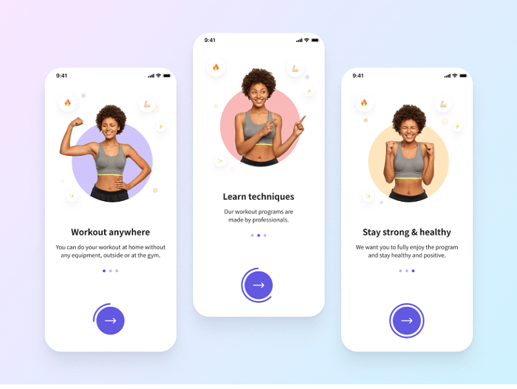
Source: Perpetio
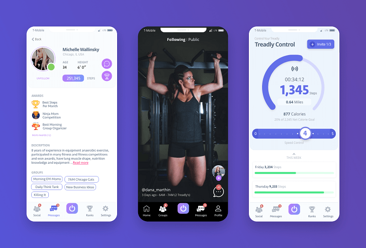
User profile
Similar to onboarding, the user profile is a necessity for most apps. It requires the user to give their name, payment details, social media links, actions in the app, and so on. So, what makes the user profile design in fitness apps different from others?
Fitness apps ask for unique data that is not often found in other apps. We mean details like age, height, weight, gender, etc. – anything that concerns the user’s health. These parameters matter significantly in fitness apps and help users set realistic goals.
When designing a fitness app, you might consider adding goals as a separate screen or simply making it a part of the user’s profile. Either way, remember, there is no point in asking for specific details if you don’t intend to use them for goal setting, choosing workouts, etc.

Payments are silently stalling startup growth
High fees. Failed payments. Single point of failure. Our report shows why payments are holding startups back and how to fix it.
Download The Report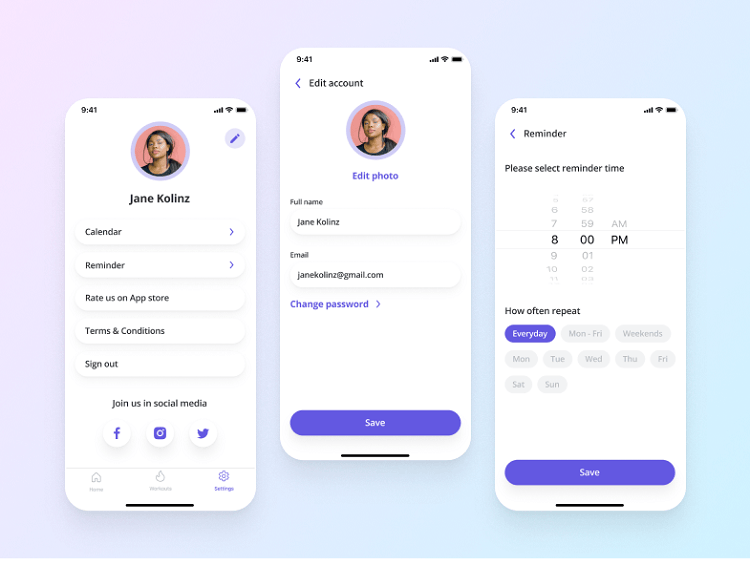
Source: Perpetio
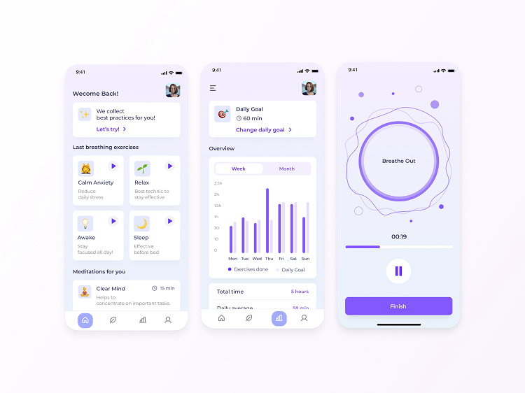
Home screen
The home screen is the main hub of your app. It should house all the essentials for getting started in the app while, at the same time, not overwhelming users with numerous choices to make or too much information.
“How can I achieve that?” you might ask. Good question! It is all about careful planning. Before designing your app, it is crucial to analyze what your potential users want to accomplish, their priorities, and for what purpose they need the app.
By conducting user persona research, composing information architecture, and understanding h your user’s journey, you can identify the features that are best to add to your home screen. Speaking of research – if you want to know more about the role of research in design, we discussed it here.
Let’s look at an example. If you are working on an activity tracking app, you might consider adding personalized statistics to the home screen. If your app is focused on fitness workouts, it would make sense to offer a “workout of the day” or suggest exercises to get the user going. Remember, your goal is not to shove all your app’s features into one screen; it’s about selecting those the user will need as soon as they open it.
The home screen should summarize your app’s purpose and answer any questions a user might have right away, such as:
- How many calories can I still take in today?
- Which workout should I choose?
- What biking routes are nearby?
Another way to look at a home screen is similar to a train station: it is the starting destination of any user opening the app, be it the first time ever or returning back. And there are many ways to organize a home screen. You can display several features to choose from, the entire navigation menu, or just one option — it all depends on what your app offers.
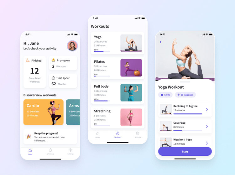
Source: Perpetio
Progress tracking
User statistics and checking progress are valuable elements of any fitness app, especially with activity tracking ones. Whether a user is keeping up with the kilos they’ve lost or the extra kilometers they’ve run, it is always pleasant to see progress.
When it comes to displaying statistics, it is all about the right data visualization. No one likes seeing raw data in text and numbers. It is much easier to understand your running progress or your calorie intake when you see the data in a graph with different colors responsible for each segment, rather than a set of numbers that you have to analyze yourself – don’t you agree?
If you want your data display to be effective, it is best to limit your charts and graphs to the most essential elements and aim for a somewhat minimalistic look. The main point of visualizing data is to simplify its understanding for the users. Cluttering too many components will only bring more confusion.
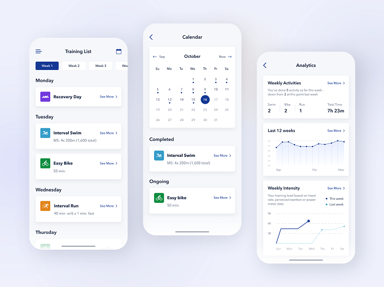
Source: Perpetio
Organizing your app’s resources
Suppose your app includes a set of workouts, recipes, meditations, or other useful resources. They shouldn’t be piled up in one place causing your users to scroll, scroll, and scroll to find the exercise they need.
Let’s switch roles for a minute. Imagine yourself as the user of a fitness app, perhaps a yoga one. If it offers dozens of routines but they are not sorted in any way, you’ll probably look through several at the top of the list and give up – maybe even delete the app.
However, if the practices are divided into three levels of difficulty and sorted according to the focus of the routine – be it muscle strength or flexibility – choosing a lesson will be much easier. If you go a step further and add filters like the length of the routine, your user will find the perfect option in less than five minutes.
Categorizing your resources can help organize everything you have to offer. It saves users a tremendous amount of time while providing them with a better app experience overall. To be sure your app is organized and attractive to users, it is important to think through how you will arrange all the information and resources before getting started.
The point of an appealing UI/UX design is not just pleasant color combinations (which is, by the way, still important). It is about giving users the best experience possible by ensuring their interaction with the app is smooth and easy.
Source: Perpetio
Creating a community
It’s time to look beyond user profiles and organization. One incredible feature to consider when designing your app is an app community, which is becoming more desirable every day.
Building communities around fitness apps can help users stay motivated and inspired to continue their fitness journey when it gets challenging – which is pretty common. By being a part of a community, they can find the encouragement they need to keep up with their goals while interacting with others who have similar interests.
Community engagement can come in a variety of forms, from separate screens to various pop-ups. You might think of examples like:
- A media feed where users can see the achievements of their friends
- Challenges to keep going when it gets tough
- Cheers for “a job well done” from other users
- Allowing users to contribute to the app: adding new running routes, recipes, sharing advice, etc.
- An area to simply chat
By adding a community feature to your fitness app, you are sure to attract more users who are craving the extra encouragement on their journey to be healthy. We all know it takes a team to succeed.
Source: Perpetio
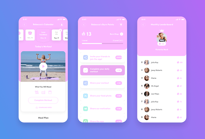
Gamification
Adding gamification to fitness apps is in no way obligatory, only a way to bring more interaction while having a blast. Gamification usually comes as a separate game element for apps. However, there are fitness ones like Zombies Run that are fully based on a gaming experience as their motivational tool.
Common ways to integrate gamification into your fitness mobile app design include adding challenges, badges, achievements, leader boards, and so much more. These features are guaranteed to help make your app more engaging and offer users a unique approach to being active.
Let’s be honest – getting physically fit is not always fun, especially when you are new to it. Not all people use fitness apps because they are big fans of exercising. Some just know it’s time to get fit or lose weight and download a fitness application to help. By adding gamification, you can help users achieve their aims while having a good time.
Source: Perpetio
What other screens can you add to your fitness app?
We’ve discussed the most important screens to take into account when designing any kind of fitness application. Whether it is a workout app or a running solution, a convenient home screen and well-organized information will most likely be your top priorities. But what about other screens? It all depends on your app. Additional features you might need are:
- Calorie counter
- Calendar and scheduling
- Activity tracker
- Barcode scanner
- Social media integration
- And others, depending on your application type.
The bottom line
Creating an excellent fitness app UI and UX design might be a not-so-easy task – like getting fit. But, similar to exercise, the effort always pays off. By taking all the best practices we’ve mentioned into account, you can develop an application people will love and want to use on a daily basis.
At Perpetio, we believe sharing is caring and are always happy to exchange inspiration with one another and our readers.
If you felt inspired to build your very own fitness app –– now that you know how to utilize all the best design practices — reach out to discuss your idea with us.